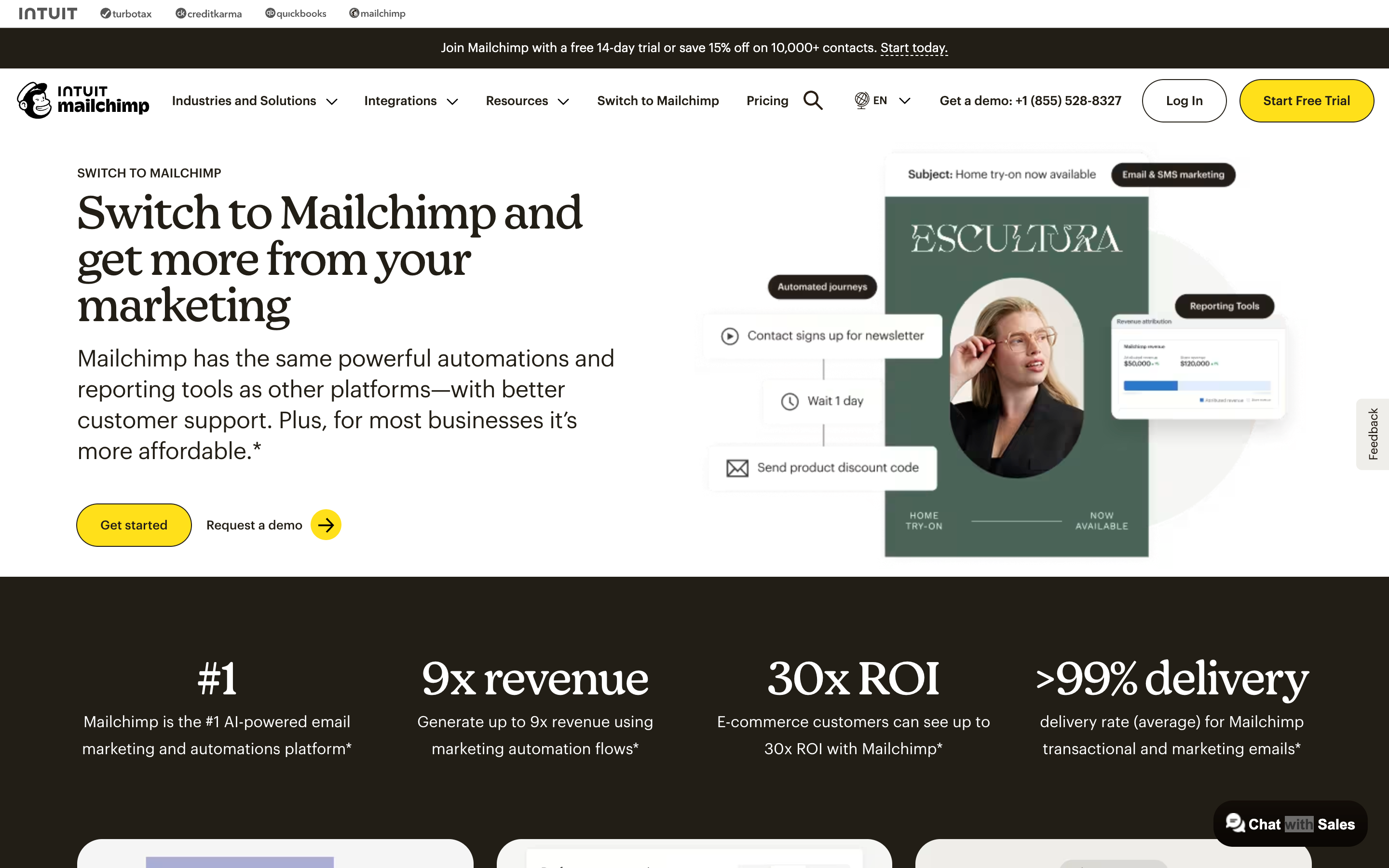
Mailchimp Concept
A Homecoming to Where It All Started
2026Speculative concept
An unsolicited rebrand concept. Not client work, and not affiliated with or endorsed by Mailchimp or Intuit. All Mailchimp marks belong to their owner.
Problem statement & insight
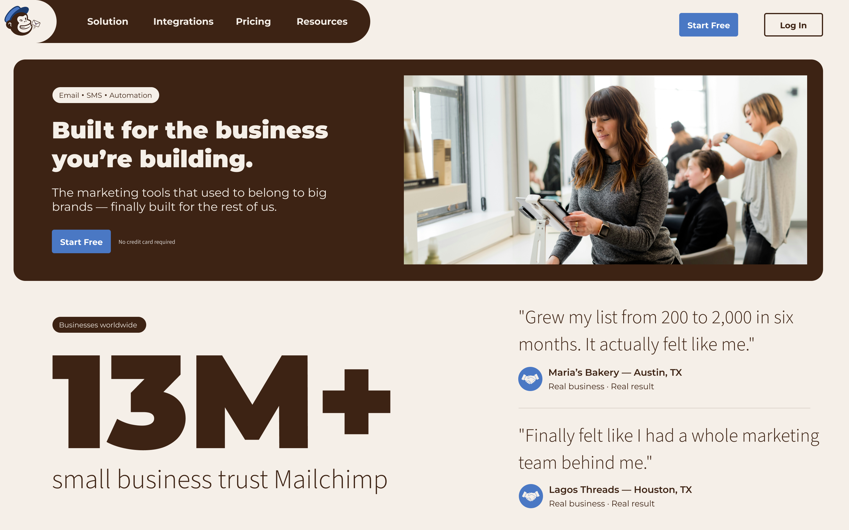
Mailchimp still believes in the small business owner. The brand just forgot to look like it.
Since the Intuit acquisition in 2021, Mailchimp reframed its brand voice around platform credibility and enterprise ambition — stripping away the down-to-earth, human origin that made small businesses trust it. The visual system is technically still there. The soul is gone.
The work
Mailchimp was built for small businesses from the start — an email tool for people running a shop, not a platform for procurement departments. The brand said so out loud: Freddie the chimp, the wink in the copy, a voice that felt made by people who liked small businesses rather than one selling to them. Then Intuit acquired it in 2021, and the company drifted toward enterprise while the personality got optimized out — flattened into the same competent, forgettable SaaS gray as every competitor it used to stand apart from.
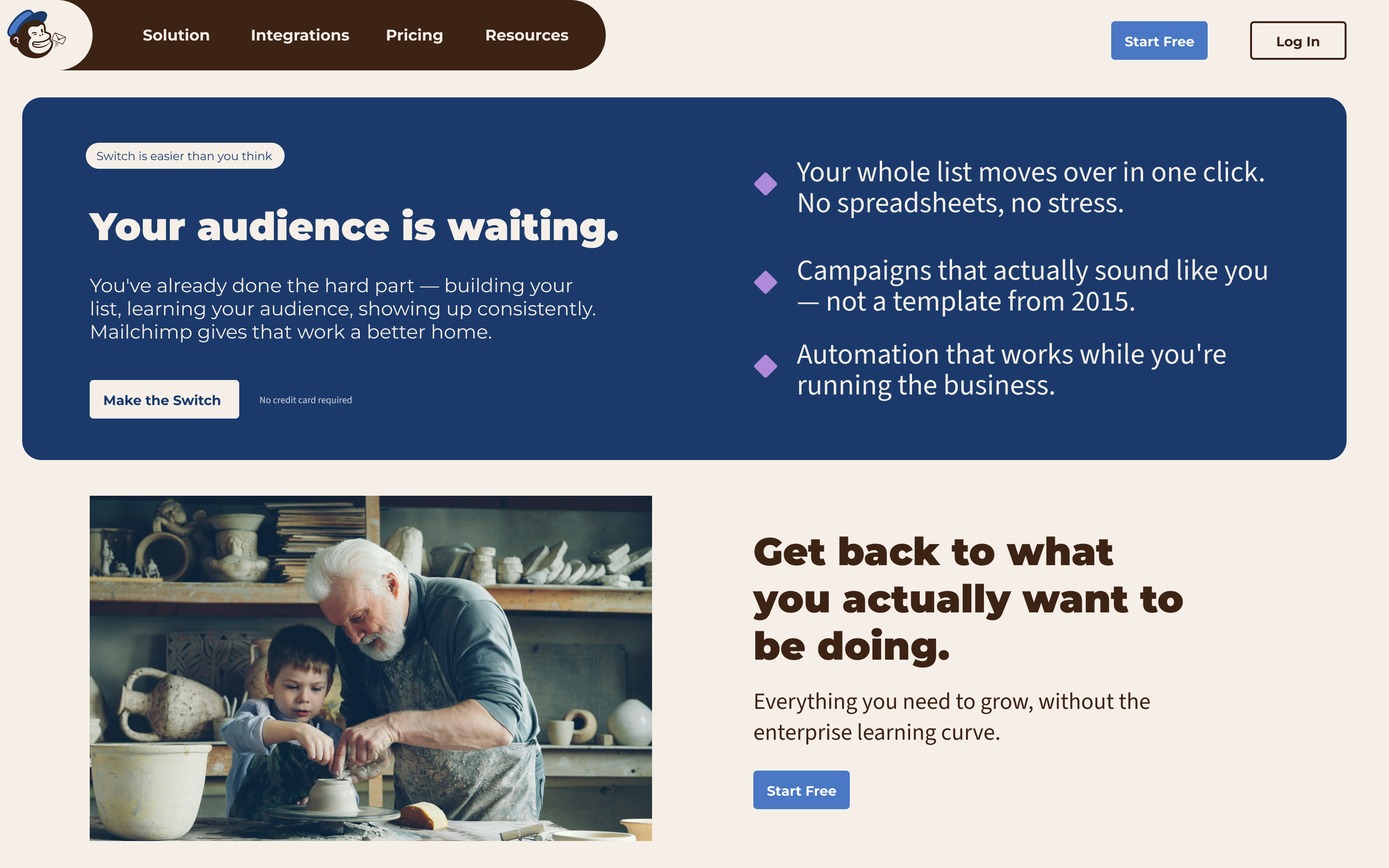
This rebrand doesn’t invent a new Mailchimp. It recovers the one that was already there. Heritage Brown and Confident Blue are pulled from Freddie’s own original colors; the system argues that Mailchimp never needed to look like enterprise software to be taken seriously — it needed to look like itself. Everything here was built to prove the personality and the credibility were never in conflict.
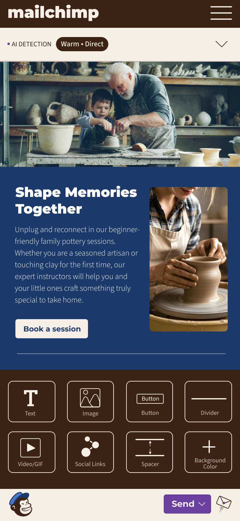
Four colors, four defined roles, no ambiguity. Blue means move, purple means make. Nothing in the system is decorative — every color has a job, and a component either earns one of them or it doesn’t get one. Built entirely from scratch, no UI kits or templates, with every primary text pairing held to WCAG 2.1 AAA.
Mailchimp: the homecoming
Brand Identity
The rebrand unearths a forgotten heritage rather than inventing a new system. It acknowledges the brand’s evolution by argument, not surrender — proving Mailchimp never needed Cavendish Yellow to be credible.
1 Logo


Primary
Freddie returns to his roots with his original Heritage Brown fur and Confident Blue hat. By grounding him in his historical colors and giving him an active prop, he transforms from a decorative element into a mascot with intention.

Secondary
The envelope is an emotional symbol, not a technical one. The Founder’s White body and Creative Purple seal represent the act of putting things into the world, elevating Freddie from a mailman to a catalyst.
2 Color system
- Founder’s White #F5EFE8 Content surface / the base
- Heritage Brown #3D2314 The anchor / container
- Confident Blue #1B3A6B The bridge / transactional action
- Creative Purple #6B3FA0 The catalyst / creative activation
3 Typography
Header / display
Switch
Montserrat
Pushed to extreme scales and tight tracking for editorial edge. This carries the structural authority so the layout doesn’t read as generic tech.
UI / body / labels
Everything you need to grow, without the enterprise learning curve.
Source Sans 3
Shown in a near-match fallback — not the licensed face.
Clean, warm, and highly legible. It absorbs the utility and never competes with the headlines. Neutral carrier for content.