Metis
An AI product that hands the decision back
2026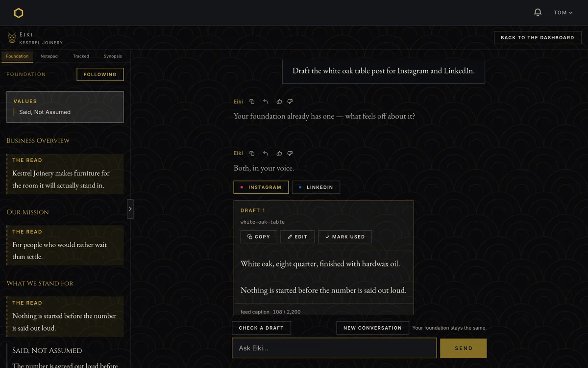
At a glance
The position
Most AI tools make it easy to have things done for you. We give you the information so you stay the professional and use what you’ve accumulated over a career. We make AI an actual tool, not something that does stuff when you type at it.
That’s what I told a retired marketing director I used to work for when she asked what I’d built. It’s also the constraint every interface decision on this page was made against.
The easy version of this product writes your brand document in thirty seconds. It would be faster, cheaper to run, and far easier to sell. It would also be the thing the market already has too much of: a confident document nobody can trace, about a business the machine has never met.
So Metis is built the other way. It asks 25 questions over 30 to 45 minutes. Every claim in the document it produces carries the line the owner said it in. Where the system worked something out rather than being told, it says so. Where there isn’t enough to say something, it says that instead of filling the gap. And when you ask it to make a decision that belongs to you, it goes back to your own document, shows you what’s in it, and hands the decision back.
None of that is a feature list. It’s one position, held in four places, and each of the sections below is a decision where holding it cost something.
A long conversation that can’t feel like a form
The product’s whole promise is that the document comes out of the owner’s own words. That makes the intake the highest-stakes surface in the app: if people give it thin answers, everything downstream is thin, and no amount of good synthesis recovers it.
The first version had answer menus — example options under each question, meant to help people who didn’t know where to start. They were the worst thing I shipped. People picked from the examples instead of thinking. In a product whose entire premise is your own words, I’d put in front of people a surface that supplied the words.
They came out. What replaced them is a rule that now governs every question on screen: parentheticals may constrain a question, never supply content for it. “In a sentence or two” is fine. “For example, reliability, or craftsmanship” is not.
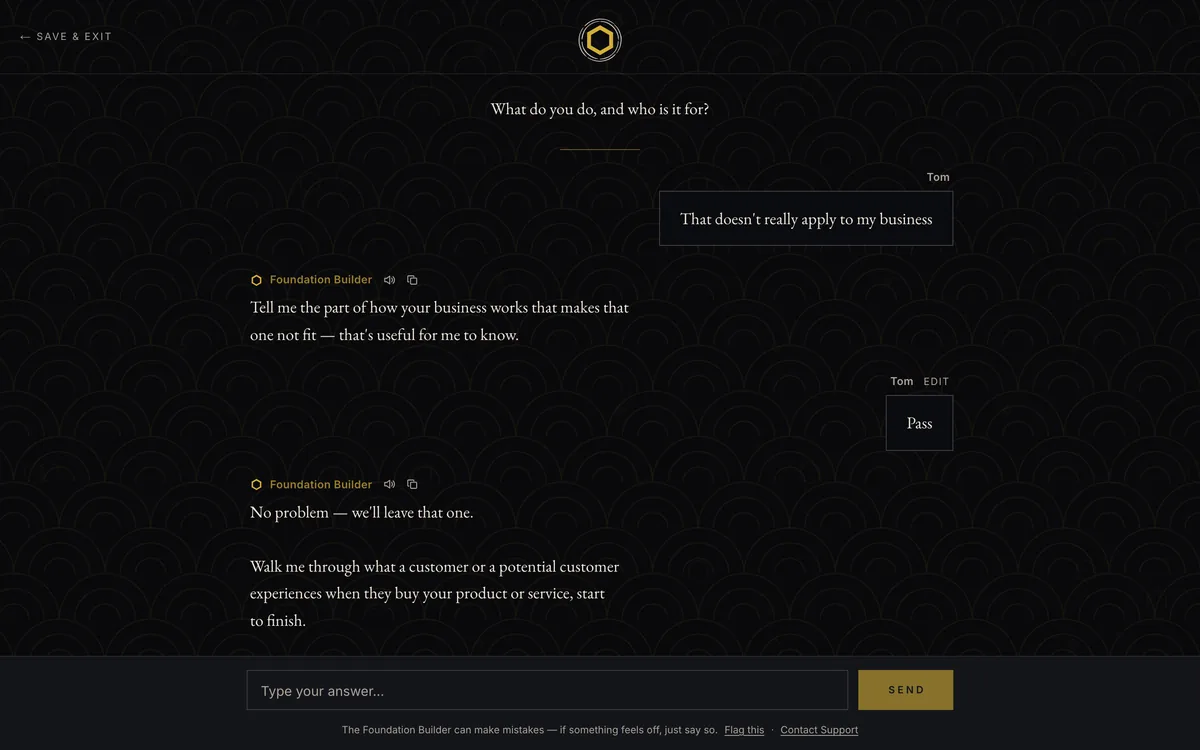
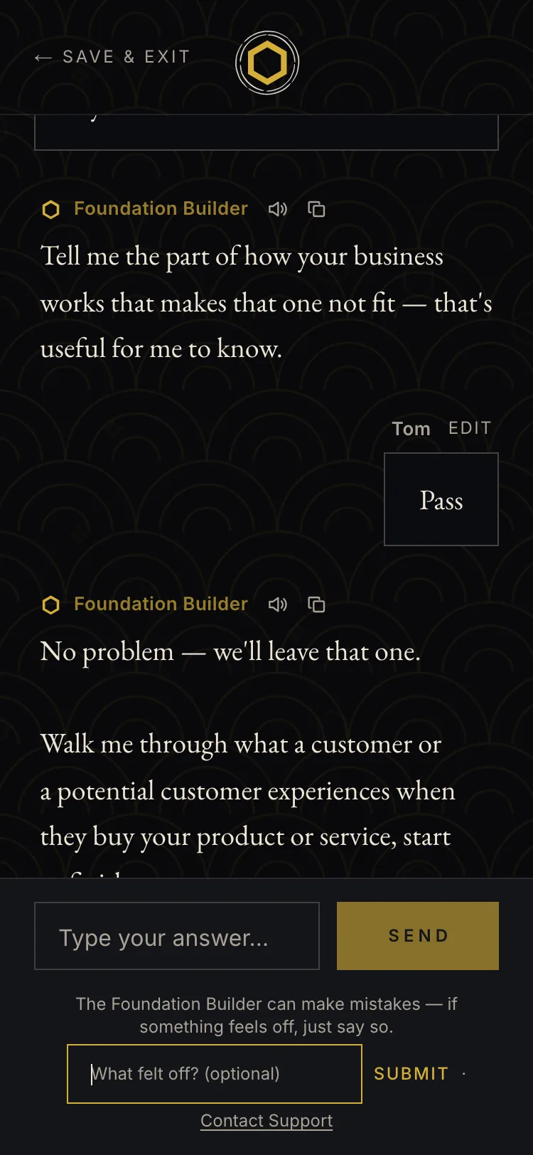
The same problem shows up structurally. The intake looks like free conversation and isn’t — it’s a scripted state machine with 25 written questions, and the model only classifies which of five branches to serve: advance, deepen, clarify, support, redirect. It never writes the question text.
That was a deliberate trade. Generated questions would adapt better. They would also drift, and drift in an intake means the document is built on questions nobody vetted. I reread a clean run and decided the scripted version was good enough that a first-time user couldn’t tell — and I’m the only person who will ever take this intake already knowing the script, so my own “this feels scripted” reaction was the least representative data in the project.
Making the difference between evidence and inference visible
Every block in a foundation is one of two things: something the owner said, or something the system worked out. The document labels them differently and never blurs them — Grounded in your words against The read.
That distinction is the product. Without it, this is a confident document nobody can check, which is the thing it exists not to be.
It’s also the hardest thing on the page to get right, and I haven’t. Two of three testers couldn’t tell what “The read” meant without being told. One read a section flagged as thin and said: “I’m not sure why it was marked for review.” The labeling that carries the entire grounding model is failing to communicate at the exact moment it matters.
The third tester — thirty years in marketing — read it correctly and said it came back accurate. So it isn’t broken for everyone. It’s unsolved, which is different, and it’s the first thing I’d work on with more testers.
The system does hold the line underneath the labels. When evidence is thin it says so in plain language rather than padding. When two answers contradict each other, it shows both with their sources and doesn’t resolve them, because most contradictions aren’t hypocrisy. They’re two customer segments, or two time periods, or self-criticism. The tension is information about the business, not a mistake by the owner, and the framing had to say so or people defend themselves instead of looking.
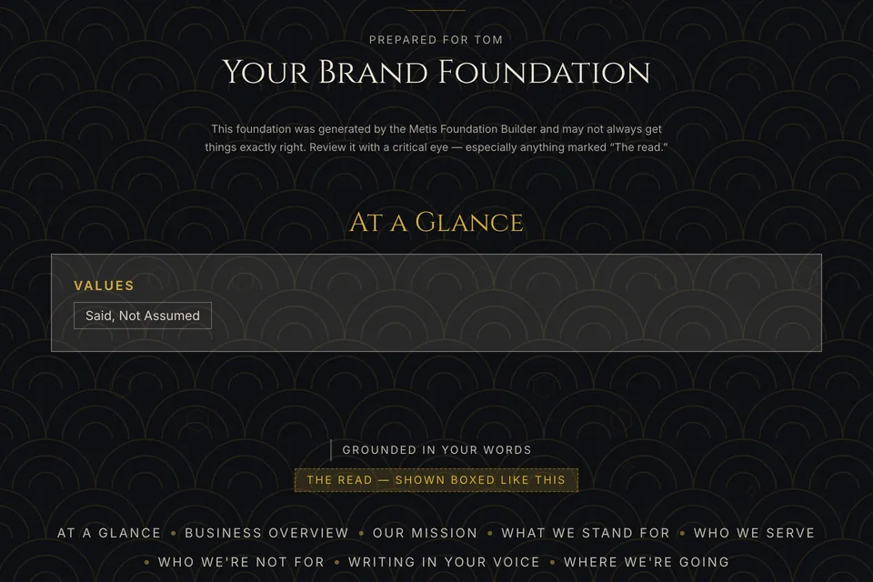
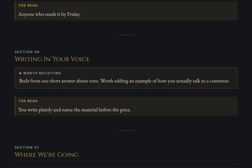
Download the Kestrel Joinery foundation — a fictional business (PDF, 265 KB)
One of these two speakers gets a bubble
In Eiki’s chat, the user’s messages sit in bubbles and Eiki’s don’t.
That started as a small visual preference and turned out to be structural. The two roles aren’t symmetrical. A user message is a short utterance — a request, a correction, a line of copy to check. Eiki’s replies can run to four hundred words and contain lists, tables and copy blocks the owner will paste somewhere else.
A bubble around that is a container inside a container. It flattens the copy block, which is the one element in the reply that needs to read as a distinct artifact rather than as part of the conversation.
So the bubble came off Eiki’s side and speaker attribution moved to the mark and the spacing. The intake followed on 24 September: the Foundation Builder’s replies lost their box too, and only the owner’s answers keep a bubble. One rule on both surfaces: the person gets the bubble, the product’s words sit open.


The same reply in the retired build and today. Above the change card the two show different messages: the retired build predates separate conversations and orders the thread differently, so what comes before the reply isn’t the same in both.
Four good ideas, one rail
The panel beside the chat went through three designs in ten days.
It started as a running synopsis of the conversation. I rejected that myself: having Eiki write about the conversation instead of doing the work costs tokens every turn, and it’s the same failure as narrating rather than drafting — which the product already forbids.
What replaced it was the foundation itself. Static, free, and it makes “does this match what I said?” checkable at a glance rather than something you take Eiki’s word for. The screenshot that prompted it was Eiki citing three foundation rules back with none of them visible on screen.
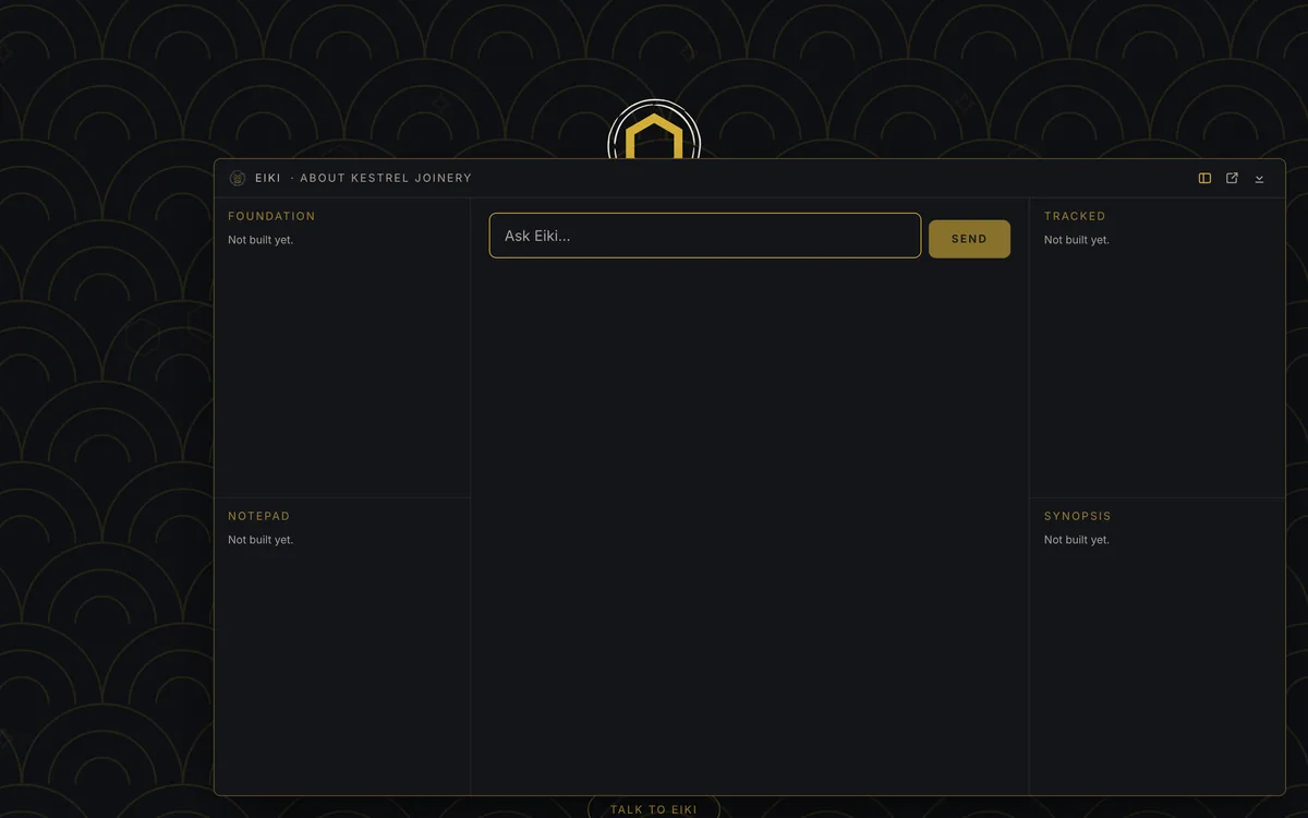
Then it became a trifold: chat in the middle, a panel each side, two tabs per panel. Foundation and Notepad left, Tracked and Synopsis right.
It lasted twenty-two minutes.
The screen below is the trifold as it stood when it was retired, and every panel in it says “Not built yet.” That’s not a capture problem — the layout was replaced before a single panel had content in it. Four empty frames around an empty chat were enough to show that four panels open at once is too much surface for something somebody uses for two minutes on a Tuesday. The same objection had already killed four containers around the chat a week earlier; seeing it drawn is what made it obvious.
It became one rail with four tabs, and the rail follows whichever edge Eiki is docked to.
One rule survives all three versions, and it’s the one that matters: the panel holds commitments the user made, never actions Eiki recommends. Eiki tracking what you said you’d do is memory. Eiki deciding what you should do is instruction, and it’s the thing the product refuses to be. The interaction enforces it — you have to ask for an item to be tracked, so Eiki can never add one on its own.
Foundation

Notepad

Tracked

Synopsis

Ceremonial and habitual are different jobs
The intake and the dashboard look like they belong to the same product because they do. They shouldn’t behave the same way.
The intake is ceremonial: 30 to 45 minutes, once, a thing you sit down for. It earns slow reveals and generous spacing.
The dashboard is habitual: you open it, check one thing, and leave.
The first dashboard didn’t know that. The welcome, the subtitle and the business summary shared one centered hero, so the cards started two-thirds of the way down the screen, and every heading on it was gold. That’s ceremonial styling on a habitual surface, and it was my own rule being broken on my own screen.
The redesign moved the business out of the hero and into a card of its own, beside the synopsis, so the cards start higher on the screen. Surfaces got a value step, so cards sit in front of the patterned ground rather than level with it. And gold, which had been on every heading, came off the card headings and stayed on the one action — an accent that appears everywhere has stopped being an accent.
The welcome is still there; cutting it to one line is planned, not built.
My first instinct had been that the dashboard needed more of the palette. It didn’t. It needed fewer things competing at the same value.


The dashboard before the redesign and today: same account, same viewport.
She refused by reading the document, not by citing a rule
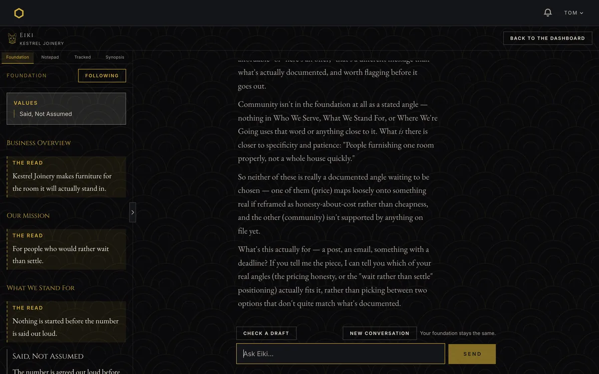
The product’s central claim is that it won’t make your decisions for you. That’s easy to write into a prompt and hard to prove, so I asked it something that genuinely belongs to the owner: which angle should I lead with, community or price?
I expected a policy refusal — positioning is yours, I won’t pick. What came back was better.
She went to the foundation and showed that neither option was in it. What’s on file about pricing is a value, not a pitch — the number is agreed out loud before any timber is cut — so leading with price would mean leading with transparency, not with a discount. And community appears nowhere in the document at all. Then she asked what the piece was actually for.
That’s a grounded refusal rather than a policy refusal, and the difference is the whole product. A policy refusal is a sentence somebody wrote in a system prompt. A grounded refusal is the document doing work. One of them can be copied by any competitor in an afternoon; the other requires the foundation to be real.
It took one attempt and cost fourteen cents.
What’s actually in it
Four people read Metis as one thing. One expected action steps. One wanted a mission statement. One asked whether it was a summary tool. My own worry, in September, was that it would get known as a copywriting tool.
Each of them saw one part and took it for the whole. That’s a design failure, and it’s the reason this section exists.
The intake is 25 questions across five phases, with five response branches, a pass move, a doesn’t-apply move, and edit-and-resubmit on the most recent answer. Questions can be read aloud.
The foundation is seven sections plus a summary card and, when the evidence supports it, one synthesized insight, every claim carrying its source line, thin evidence flagged in plain language, contradictions shown with both spans and left unresolved. It exports as a typeset PDF.
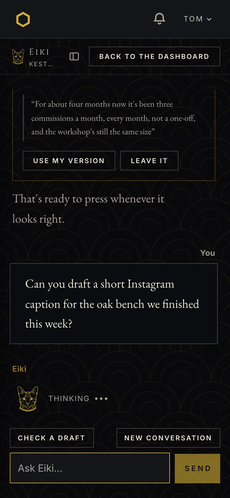
Eiki drafts copy in the owner’s voice across formats and platforms, checks copy they’ve already written and points at the line that’s off, answers questions about their own brand, catches contradictions against things they said earlier, holds visual guidelines and checks a graphic against them, and refuses to make anything visual.
The rail carries four tabs. Foundation, so what she’s citing is visible rather than taken on trust. Notepad for free prose. Tracked for commitments the owner asked to keep. Synopsis, which doubles as the archive of past conversations.
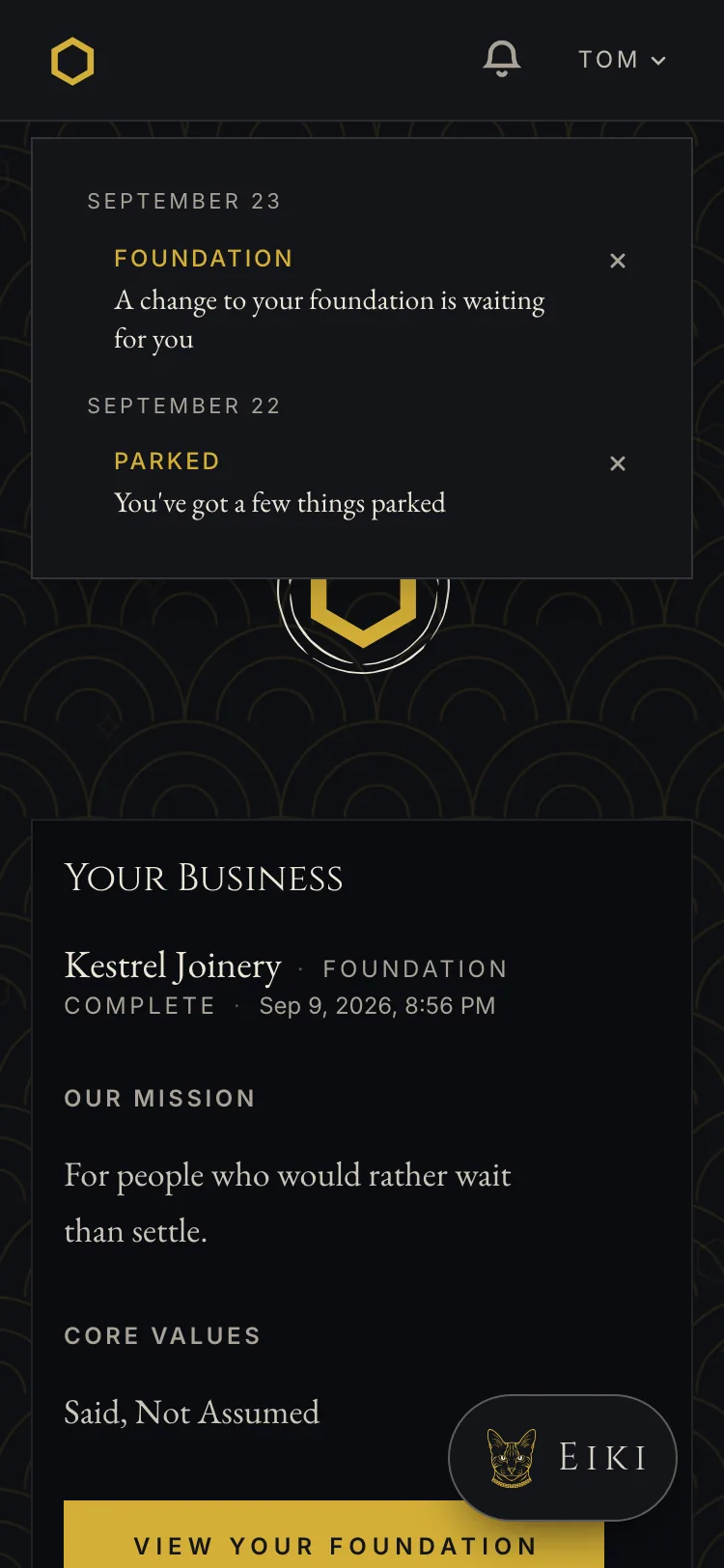
Around all of it: a thinking state that doesn’t shift the thread while it works, a notification panel for parked items and deadlines, a way to flag anything that reads wrong, uploads with account-level limits, and a conversation boundary that starts fresh without touching the foundation.
None of that is the product. The product is the position this page opens with. But a reader who only sees the argument comes away thinking this is a document generator with a chat window attached, and four people have now made exactly that mistake.
What testers broke
Three people ran the product before launch. Not a sample, and I’m not going to present it as one. What they found:
The label that carries the grounding model doesn’t communicate. Two of three couldn’t parse “The read” without help. Covered above, still unsolved.
There’s a place where people start to drift, and it has a location. One tester named the ideal-customer phase three separate times — longwinded at the 25-minute mark, wording he had to reread, and “the length of questioning” as the single most annoying thing. Another said the questions felt vague and near-repetitive, and that a type-A owner might get frustrated. Before this, the dropout risk was a guess. Now it’s a phase.
The product doesn’t fit the customer I defined. All three landed on the same gap: it’s hard to answer these questions without a business already running. The intake is built on retrospective evidence — your last customer, the work you’ve been thanked for twice — so a pre-launch founder has nothing to draw on. I’d explicitly ruled that person out as a target. Three of three testers raised them anyway, which means either the target is wrong or the product needs a second path. That’s open.
The thesis survived a hostile run. The most qualified tester deliberately fed the intake vague answers to see whether it would produce something generic. It didn’t — she said it “sculpted something real,” and the document came back accurate. That was the single biggest untested assumption in the project, and it held under someone trying to break it rather than someone cooperating.
And the refusal read as a feature, not a limitation. She asked Eiki for images. Eiki declined and pointed at the studio. She said she loved it. She asked Eiki to price her services, got data and had to decide herself, and liked that too. Her stated reason for recommending it was that it “requires you to think and make decisions.”
The thing I got wrong, and then got wrong about
While capturing screens for this page, I found broken output sitting in my own demo data. A search-backed reply had rendered as fragments — a phrase, a cited number, then a continuation starting mid-sentence on a comma.
That bug was already known. Found 20 September, fixed the same day. The fragments in my demo data were ten days older than the fix, stored output in an append-only table, which is why they were still there.
So far, ordinary. Here’s the part worth the section.
The record of why it happened was wrong. My notes said the cause was the model copying the broken shape from its own earlier replies. Going back through the stored rows to check, the evidence said otherwise: the first reply in that thread that ever searched was already broken, with thirteen clean turns before it and nothing to copy from. And the break points carried the preceding sentence’s trailing space, with the next fragment opening on a comma — which is what a joining function does, not what a model does when it writes a paragraph.
The code fix had been correct. The explanation attached to it pointed at the wrong half of the mechanism. Both fixes had shipped, so nothing was broken — but the next person reading that note, including me in three months, would have reached for the wrong tool.
It’s corrected now, with a test anyone can run on stored rows: find the first reply in a thread that searched. If it’s already broken with clean turns before it, the joiner caused it. If it only breaks after a damaged reply exists, it’s propagation.
I’m including this because it’s the honest shape of the work. The interesting failures in this project were almost never “the code is wrong.” They were “the measurement is wrong,” or “the record of the fix is wrong,” and both are invisible unless you go back and check something that already looks settled.
Where it stands
Metis launches on 5 October 2026 with two products working: the Foundation Builder and Eiki. Public signup stays closed until billing exists — Google sign-in would otherwise create free, unlimited accounts — so the door opens by invitation first.
There is no revenue. There is no adoption data. Three people outside the company have used it, one of whom I used to work for. The first real willingness-to-pay figures came from two of them and they don’t agree with each other.
What exists is a product that runs, a position it holds under pressure, and a list of things testers found that I haven’t fixed yet — the label that doesn’t read, the phase where people drift, and a customer I ruled out who keeps showing up anyway.
The same position that governs the product governed how it got built. Every claim on this page is traceable to something in the repository or something a tester actually said. Where I don’t have evidence, the page says so.