Quorum
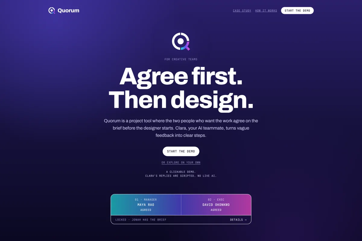
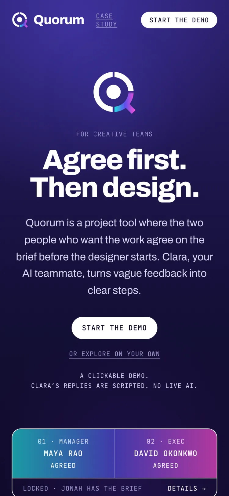
A project tool for creative teams where both approvers agree before the designer starts.
2026In one day I set the rules, designed the product and its identity, and directed a clickable demo with Claude.
A clickable demo.
Clara’s replies are scripted.
No live AI.
01 · The problem
Creative work doesn’t die from bad design. It dies before the designer starts.
I’ve been on the receiving end of this at more than one job. A rough idea lands in my inbox. Two people want it. They haven’t talked to each other. I design for one of them, the other sees it, and now I’m redoing it.
Then the feedback comes back. “Make it pop.” “Feels a bit cold.” “Can it be more premium?” Nobody means anything wrong by it. But I’m the one left guessing.
Every project tool I’ve used is built to track the work. None of them fix the part that actually breaks it: the people who want the work never agree first.
Quorum is built for in-house creative teams, where a marketing manager and an exec both sign off and one designer does the work. It fits teams with a clear manager and exec. Flat teams can turn on the Huddle. Teams with a single decision-maker or a legal review are the open questions in section 07.
02 · The rule
Quorum is built on one rule: the two people who want the work agree on the brief before the designer starts.
Two approvers. A manager and an exec. That’s the cap. Nobody loops in five people.
The name is the rule. A quorum is the smallest number of people needed to make a decision, and not one more.
There’s a Japanese word for this too. Nemawashi is the quiet groundwork of getting everyone on the same page before anything is formally proposed. That’s the whole product. Quorum just does it on purpose, in one place, before the designer is ever involved.
03 · How it works
Three stages. Each screen has one clear thing to do next, always in the same spot.
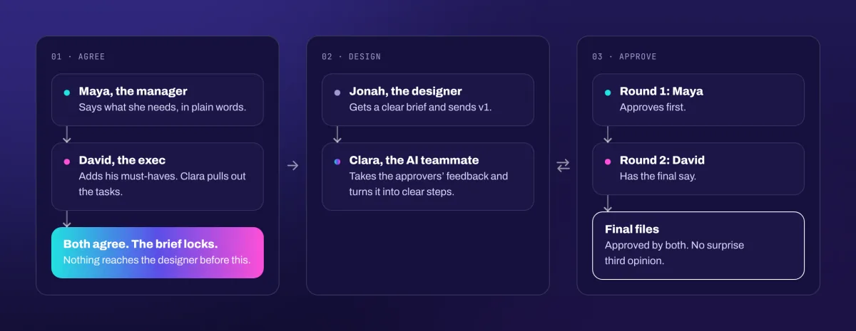
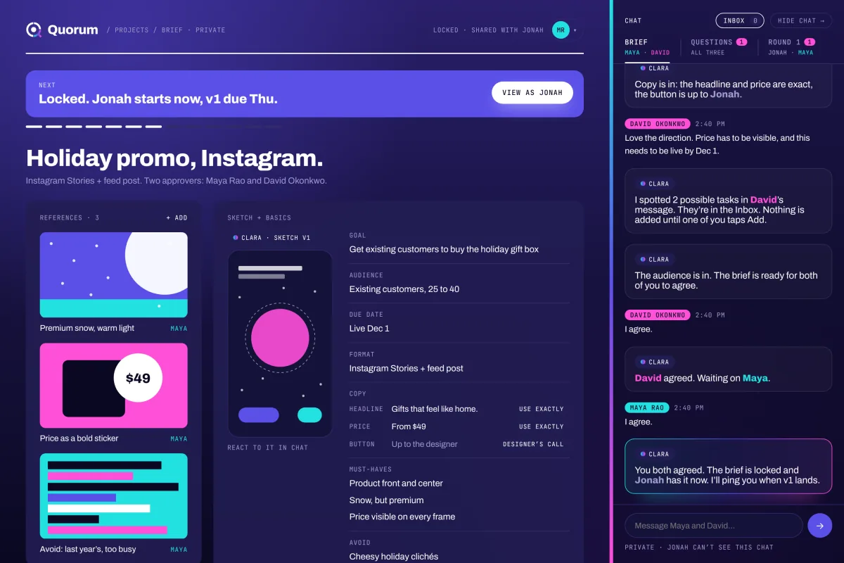
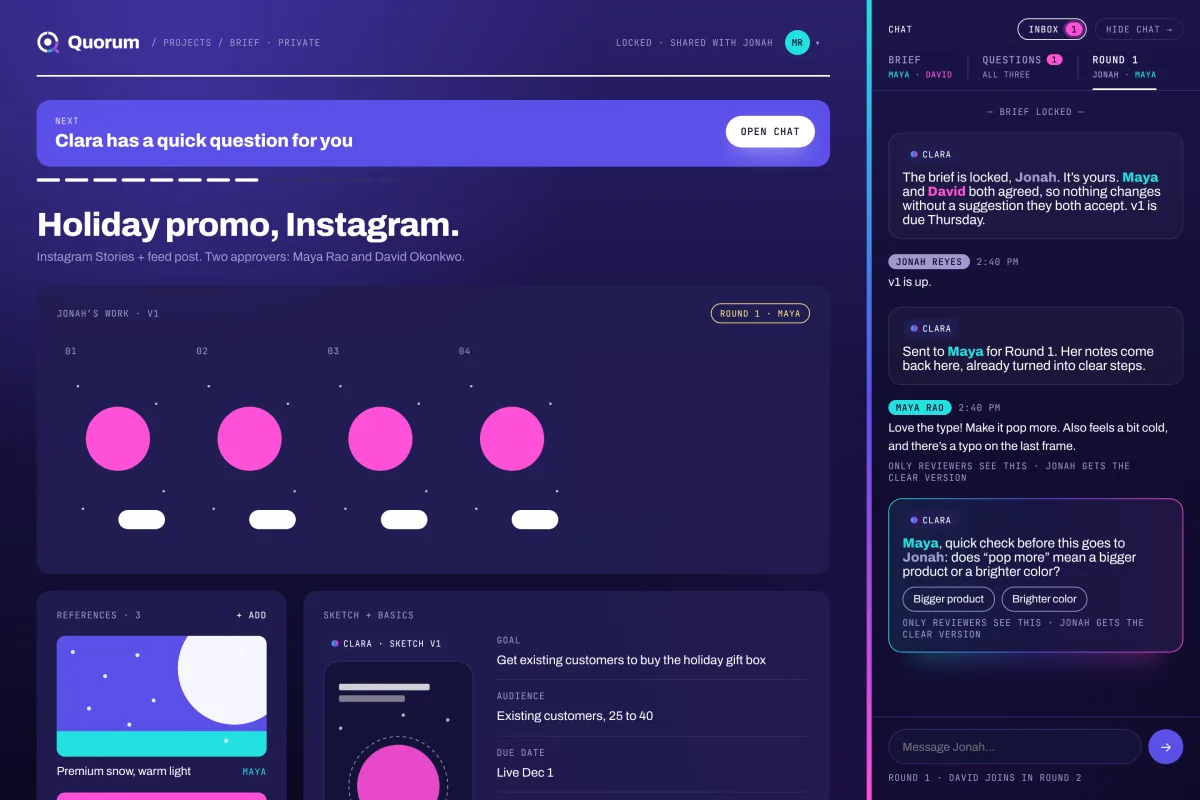
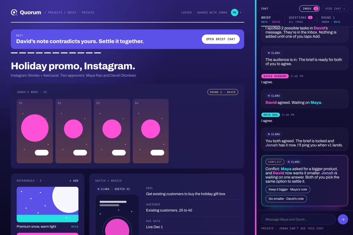
- 1. Agree. The manager describes the work in plain words. Clara, the AI teammate, drafts the brief and a rough sketch to react to. The exec adds what they need. The brief can’t lock until it has a goal, an audience, a due date and must-haves. Then both approvers tap agree. The agreement button is split in two, one half each. When both halves lock, it turns into the gradient.
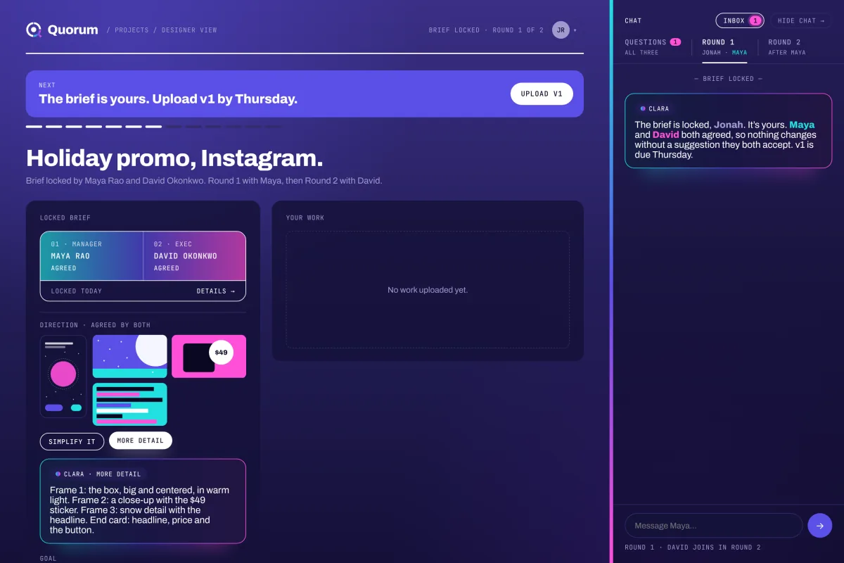
- 2. Design. Only now does the designer see it: one clean brief, the sketch, the references and the copy. If something in the brief is wrong, the designer can suggest a change, with a reason. Both approvers have to accept it.
- 3. Approve. Two rounds, one approver each. The manager reviews first, then the exec. Feedback goes back to the designer as clear steps until both sign off. Then the designer uploads the final files and the project closes.
04 · The decisions that made it
The screens came last. The rules came first, and the rules are the product.
- Vague notes never reach the designer. When a reviewer writes “make it pop,” Clara asks them what they mean before it goes anywhere. Bigger product, or brighter color? The designer only gets the clear version, with the original words underneath for context.
- Disagreements go back to the bosses. If the exec contradicts something the manager already approved, Clara holds it and flags it in their private chat. They pick one answer together. The designer never gets stuck in the middle.
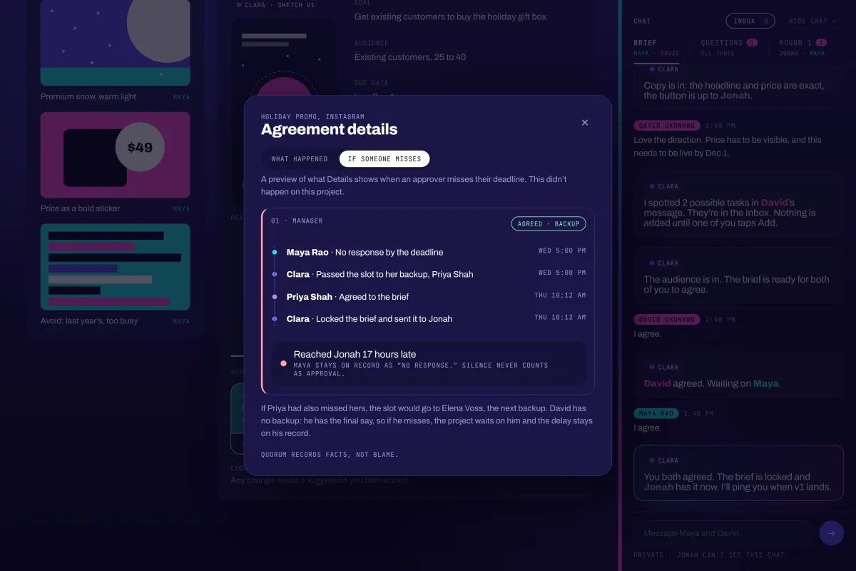
- Silence is never a yes. My first version said that if an approver didn’t respond in time, it counted as approval. That rewards the person who didn’t show up. Now if the manager misses a deadline, the vote passes to a backup named at setup, then to the person above. The exec gets no backup. A final decision maker already knows a late call is on them, so the project waits and the delay stays on their record. A manager’s week fills up with other people’s priorities, so they’re the ones who need a backup.
- Facts, not blame. Halfway through, I noticed the tool was turning into a way to call people out. Managers won’t use something that shames them. So it records names and times and never labels anyone. “Timed out” became “no response.” The timeline measures the cost to the project, not the person: “Reached Jonah 17 hours late.”
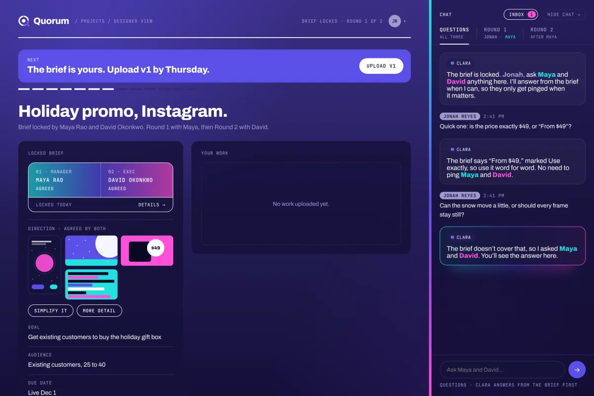
- The designer gets a voice. Locked doesn’t mean silent. The designer can suggest a change to the brief, but they have to give a reason, and both approvers have to accept it. Accepted changes are tagged on the brief, and Clara reminds each reviewer what changed, so nobody reviews against an old version. Teams that plan together can turn on the Huddle, so the designer is in the room from day one.
- Clara suggests. People decide. Nothing becomes a task until someone taps it. When a note is unclear, she asks instead of guessing. And she can’t change the brief: only both approvers can.
- Questions get answered from the brief first. After the lock, the designer can ask both approvers anything in one place. Clara answers from the brief when she can, so the approvers only get pinged when it actually needs them.
- Calm, not busy. The brief I wrote for myself said the tool should lower stress. So pop-ups only appear when it’s your move. Everything else waits quietly until you look.
05 · What I changed my mind on
I kept a decision log the whole way through, so I could see where I was wrong. A few of the bigger calls:
| I started with | I ended with | Why |
|---|---|---|
| Swiss look: square corners, hard black rules | Rounded cards, pill buttons, a soft glow on the AI | It felt blocky. It didn’t feel like a fluid, modern tool |
| A dark room for the approvers and a light one for the designer | All dark purple, two shades | White backgrounds felt wrong. One look is calmer |
| The designer can’t see who approved | Names shown | Hiding them turned accountability into a guessing game |
| Pop-ups for every new message | Pop-ups only when it’s your move | Every message popping up fought the calm promise |
| The AI was called Athena | Clara, Latin for “clear” | Athena tied it back to Metis, my company’s product. I wanted this to stand on its own. |
| A full app with real accounts | A clickable demo | A real app needs paid hosting and paid AI. As a portfolio piece, the demo already does the job |
The hardest call wasn’t in the table. The idea kept growing. Halfway through the day it had a tour, four chats, an inbox, escalation rules and a motion pass. It was drifting toward the bloated tool I set out to fix. So I froze it.
06 · The identity
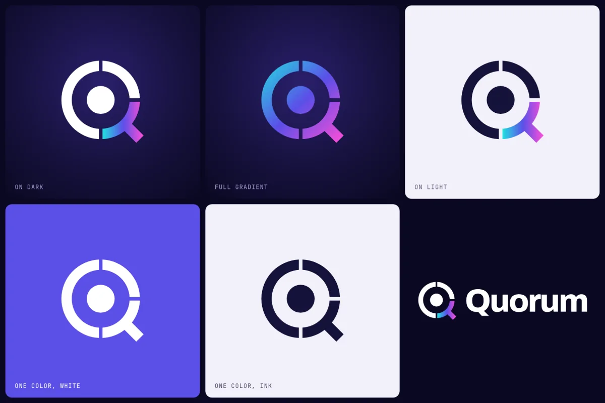
The mark is three parts around one point. The dot in the middle is the project. The two solid arcs are the two approvers. The tail is the designer, and it’s the only part in color, because that’s the creative part of the quorum.
Read together, it’s a Q. It also nods to the voting bowls ancient assemblies used to count a decision.
The animation tells the same story in order. The project appears first. The two approvers come in and settle. Only then does the designer’s tail land, with a small pulse. Agree first, then design.
Color follows one rule. In the interface, the gradient only shows up in three places. It marks Clara, the moment both approvers lock the brief, and the hero on the home page. Everything else stays plain, so the gradient always means something.
07 · What I’d test next
A clickable demo shows the rules make sense. It doesn’t prove they work. Before building it for real, I’d test seven things with real teams:
- Does the designer need a seat before the lock? Right now the brief locks the moment both approvers agree, and the designer can only suggest changes after. In real teams the manager and exec agree first, then bring the designer in for their piece. I’d test a short designer check before the lock, so it locks when all three are on board, and compare it with the Huddle setting, which lets the designer join from day one.
- Do two approvers fit most teams? Some have one decision-maker. Some need legal. I’d find the teams the cap fits and build for them. I’ve worked under a single approver who was the only expert on a partner brand, so I’d test a one-approver mode too.
- Will execs actually show up? They’re the least likely to open a project tool just to read a brief and tap a button. I’d test a sign-off they can do from Slack or email in one tap, without opening the app.
- Do back-to-back rounds still cause rework? I’d compare them with both approvers reviewing together.
- Should approvers be able to propose changes too? Right now only the designer can. In real projects the most common change is an exec changing their mind midway. I’d test letting approvers propose changes, with the same rule: both have to accept.
- Can people trust Clara? Every answer should show where in the brief it came from, and anything unclear should go to a person.
- Does it actually save time? I’d count revision rounds and days to final files, before and after.
08 · Where it stands
Quorum is a one-day side project and a clickable demo, not a live product. There are no real accounts. Clara’s replies are scripted. Each visitor’s demo runs in their own browser.
That was on purpose. The point was to show the rules in action, and you can feel them work in a few minutes with the tour.
If I built it for real, it would need a database for accounts and projects, and a live AI with a spending cap. For now, the demo says what it needs to.
Most tools help you track the work.
Quorum is about the moment before the work, when the people who want it finally agree.