FISHNESS
From a Record of What Happened to a Picture of Where You Are
2026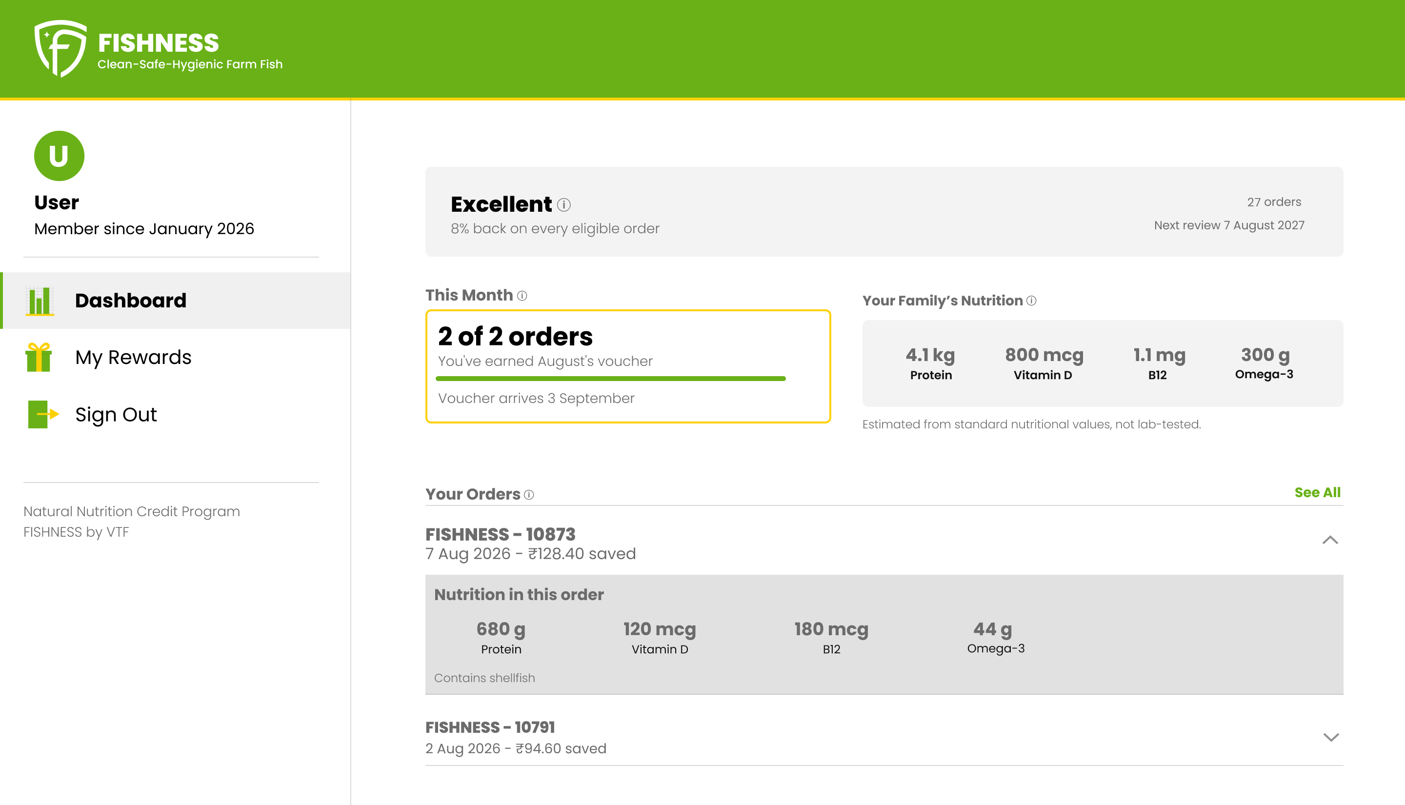
At a glance
The dashboard showed history. The program is about continuity.
Every number on the existing screen pointed backward. A member could see the orders they had placed and the nutrition those orders contained, one order at a time, one click deep. What they could not see was where they stood in the current month, how many orders counted so far, what the next order would earn, or when the voucher arrived.
The program runs on a monthly cycle. The dashboard had no concept of a month. That gap is the whole redesign — not a visual refresh, a shift from a record of what happened to a picture of where you are.
A fish company, a nutrition program, and three people
VTF farms and delivers fish in Bengaluru and Coimbatore. FISHNESS is the brand customers buy from. Inside it runs the Natural Nutrition Credit Program, and it pays two different credits. A fixed credit comes with your category, which is set by lifetime orders — Excellent earns 8% on every eligible order. A variable monthly credit runs from 2% to 15%, set by how much you order in that particular month. The program also tracks the nutrition those orders delivered — protein, vitamin D, B12, omega-3 — which is the part it’s named after.
The distinction matters more than it looks. The fixed credit is about who you’ve been. The variable one is about what you do this month, and it’s the one the dashboard had no way to show.
Three people were involved. The founder wrote the program’s white paper and makes every decision about it. The development partner built the dashboard and maintains it, and was the technical contact throughout. I was the designer, working from the live product and the white paper.
The engagement started as an audit of the wider site. The founder didn’t want to touch the storefront while a new market stall was ramping, but asked for a trial on one thing: go through the program as a member would, and come back with a redesign.
Six constraints, and what each one ruled out
Everything below was fixed before I started. None of it was negotiable, and each one removed an option.
Custom PHP with jQuery. No React, no framework I could design against. Anything I proposed had to be buildable as markup and CSS by one developer.
No component library. Nothing to inherit and nothing to fight. It meant I could define patterns freely, and it meant every pattern I defined was new work for someone else to build.
Login lives on Shopify and doesn’t move. Members authenticate on the storefront and are redirected into the dashboard. Sign-in, sign-out, and the redirect were out of scope from the first conversation.
The Shopify API is the only data source. Order history is available. Anything the program doesn’t already calculate and send would need building on the server before a screen could show it.
No brand guidelines existed. Two colors and a logo file. Type, spacing, components, and terminology all had to be derived rather than referenced.
Three breakpoints already set. 375 and 390 mobile, 768 tablet, 1440 desktop. All three were fixed before I started, which meant tablet needed an answer rather than a design.
Five blocks, in the order a member reads them
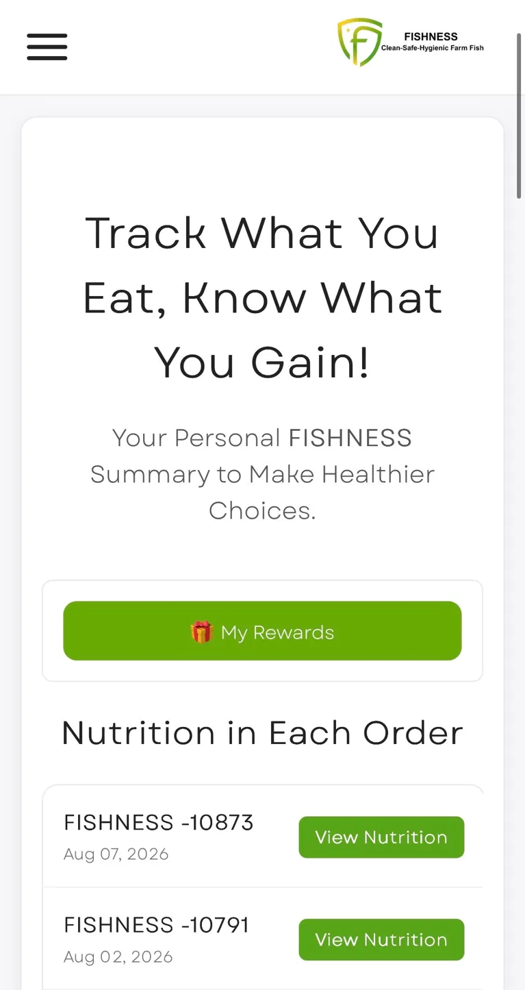
The old dashboard opened on a marketing headline, then a rewards button, then a list of orders each with its own green “View Nutrition” button. The nutrition — the thing the program is named after — was one click deep and one order at a time.
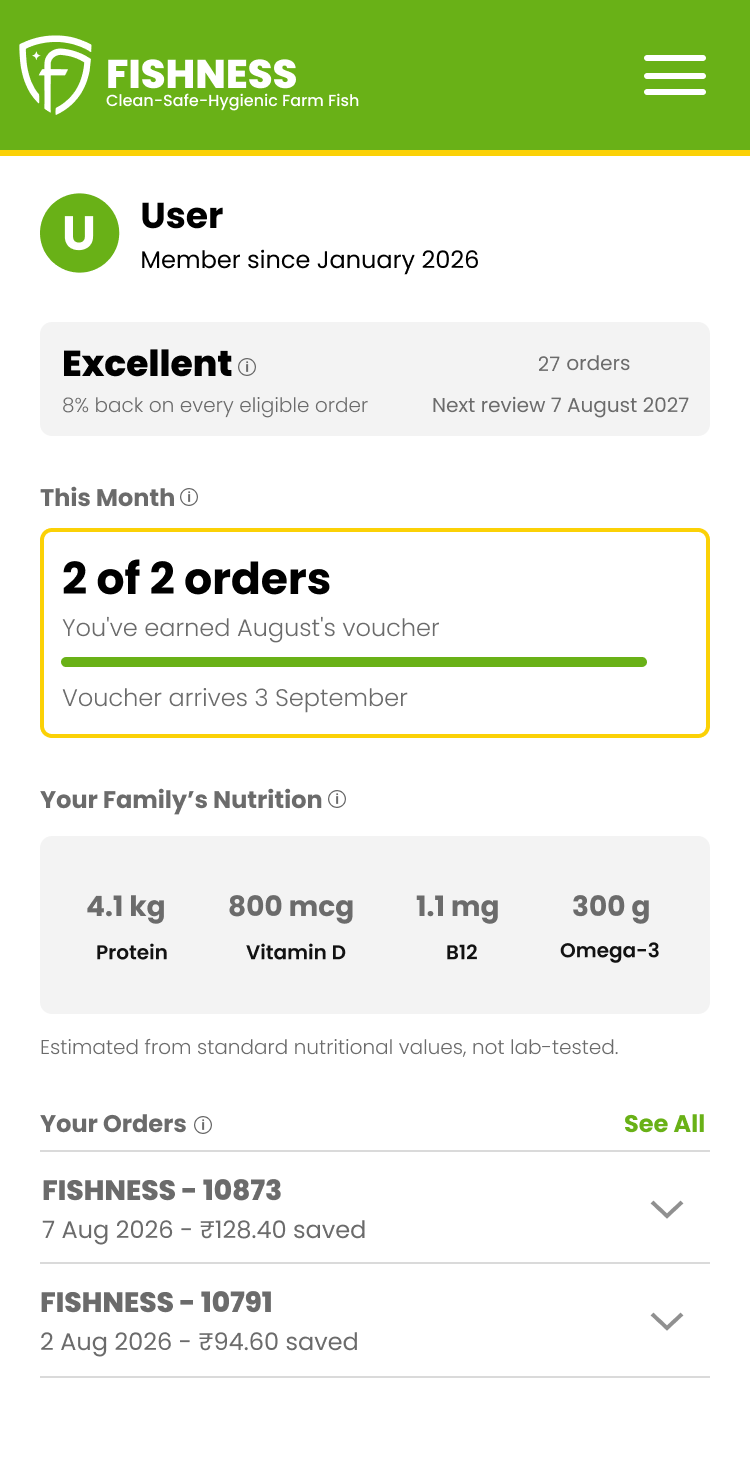
The redesign puts five blocks on the page in the order a person actually asks for them.
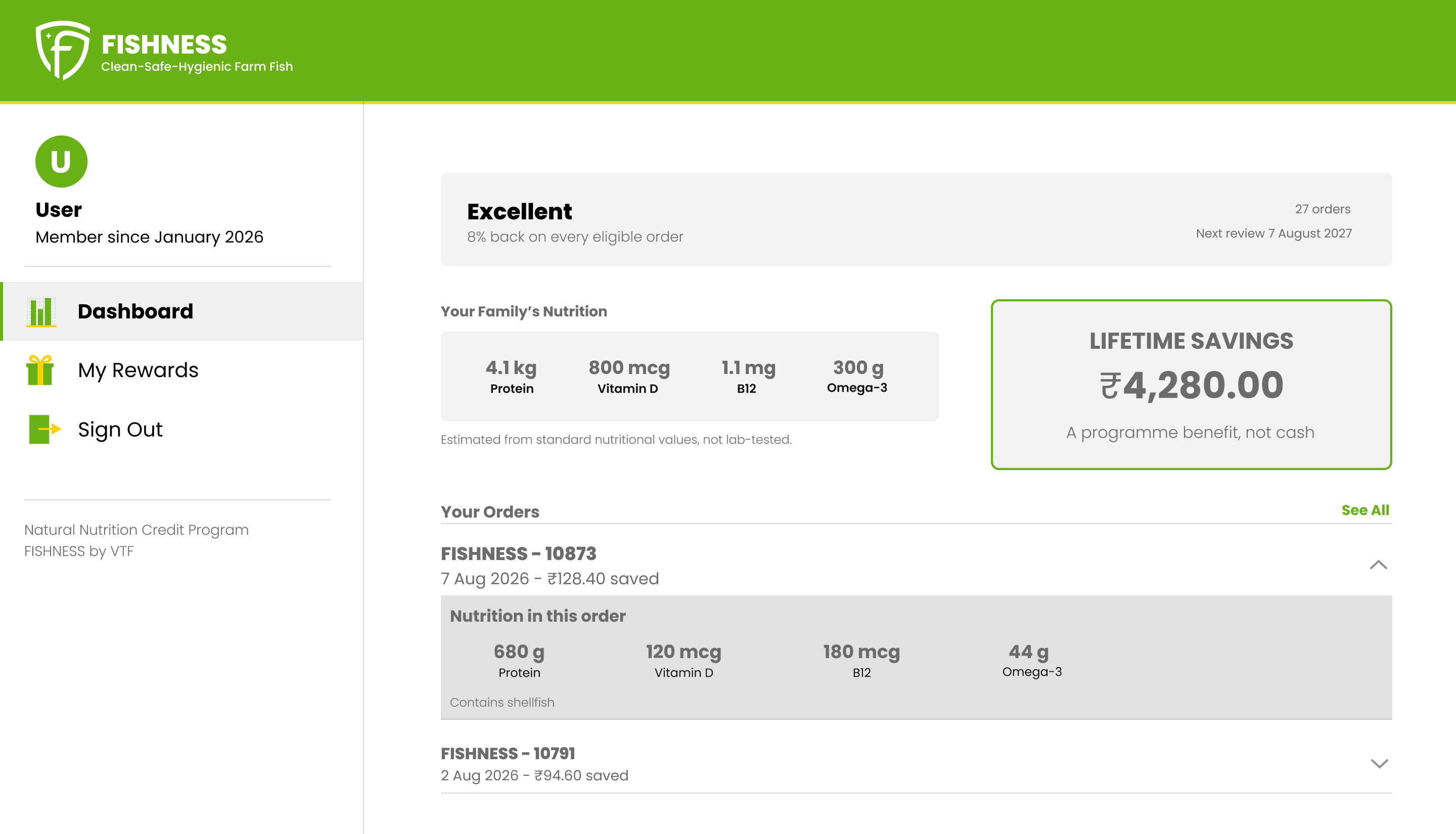
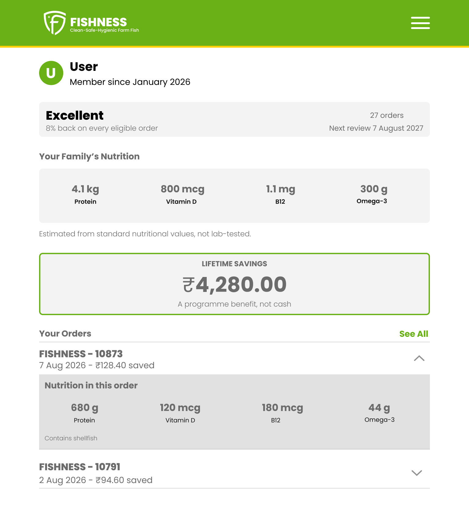
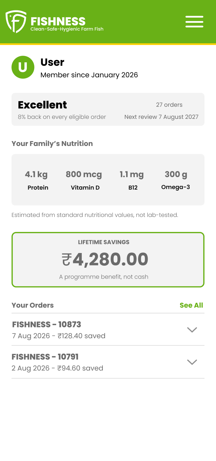
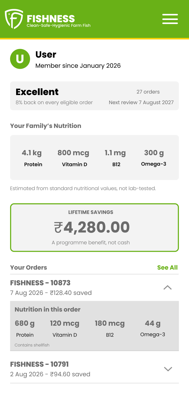
Who you are. Name, member since, and the category you’re in with the fixed credit rate it earns. Identity first, because a member wants to know the program recognizes them before anything else.
Where you stand this month. Orders counted, voucher status, and when it arrives. This block did not exist in any form. It is the answer to “how are we doing,” which is the question someone opens this page to ask.
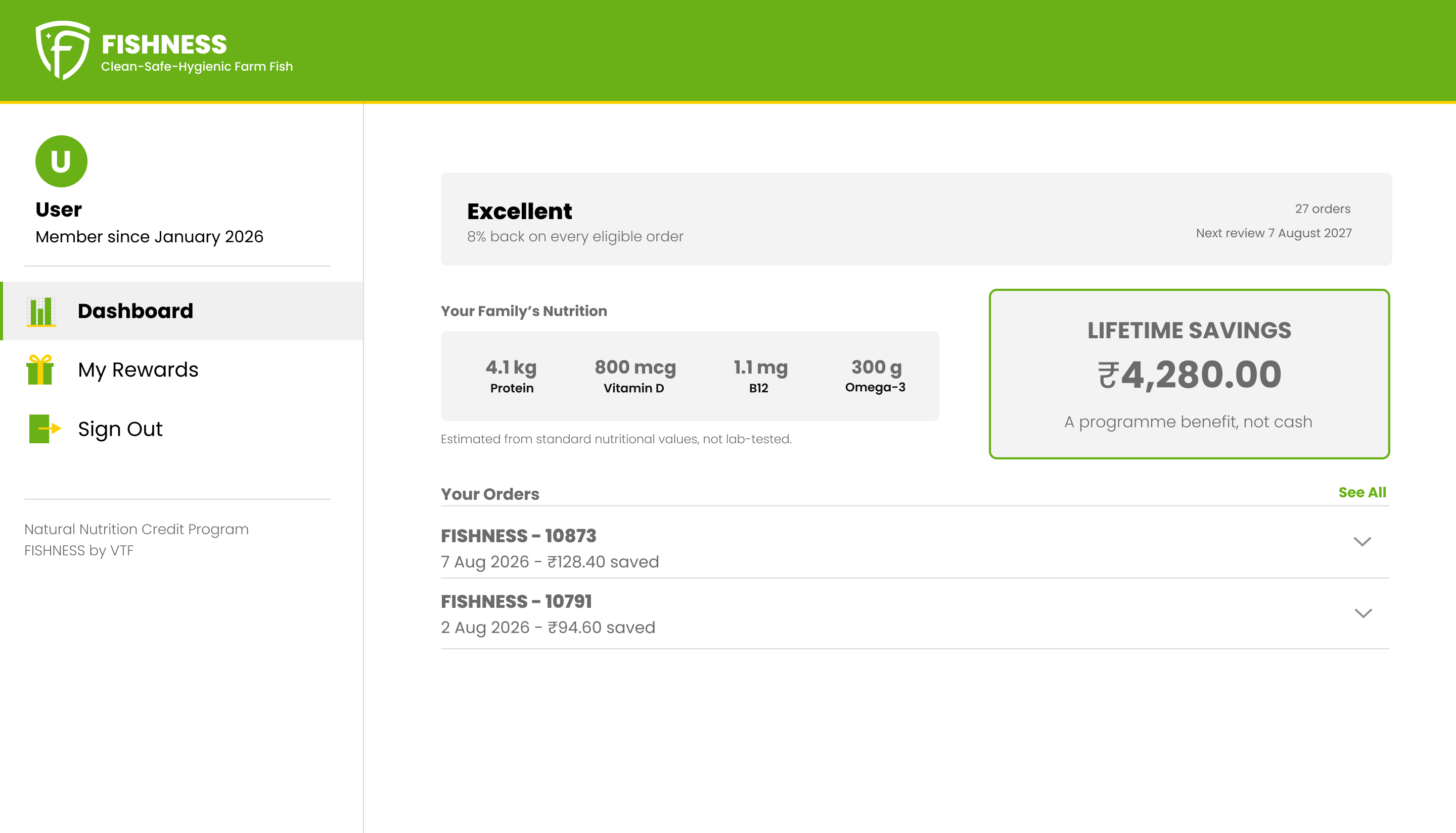
Your family’s nutrition. Protein, vitamin D, B12, and omega-3 totaled across every order, four across. Out from behind the button, aggregated rather than per-order.
Your orders. Each row showing what it earned, opening in place for its detail.
A reason when something fails. An order that didn’t qualify says why, in plain words, on the row. The product never gave a reason before, which left members guessing at a rule they couldn’t see.
Desktop uses the same five blocks across the extra width — no new content, just laid out side by side. Tablet is the mobile layout in a column capped at 600px and centered. At 768 it’s too wide to run mobile full-bleed and too narrow to earn the desktop arrangement, so it takes the mobile structure and stops it from stretching.
Two of these five did not survive contact with the data. Where you stand this month, and the reason line on a failed order, are both out of version 1 — see “The version that could actually be built” below.
Three decisions, with the reasoning
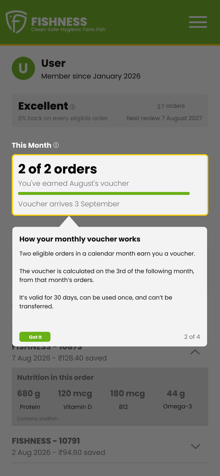
Accordion rows instead of a modal. Each order opens in place when you tap it. The alternative was a modal per order, which is what the column of green buttons was effectively doing. A modal takes a member out of the list, shows one order, and drops them back at the top; three orders means three round trips. Opening in place keeps the list intact and removes a column of identical buttons competing for attention on a screen where the primary action is elsewhere. It also costs less to build — no overlay, no focus trapping, no scroll lock.
A walkthrough on the first visit, then an icon that stays. The program has real rules — what counts as eligible, how the credit is calculated, when the voucher lands — and none of them fit on screen without burying the numbers. A new member gets a short first-visit walkthrough, one block at a time, so the page explains itself once. After that the explanation persists as a small info icon beside each block heading, opening over a dimmed screen. The rule stays available at the moment a member questions a number, rather than in a help page nobody opens, and the block itself stays short. It was the one pattern here I arrived at rather than derived from the audit. It is also the one decision here that was cut outright, for reasons the last section explains.
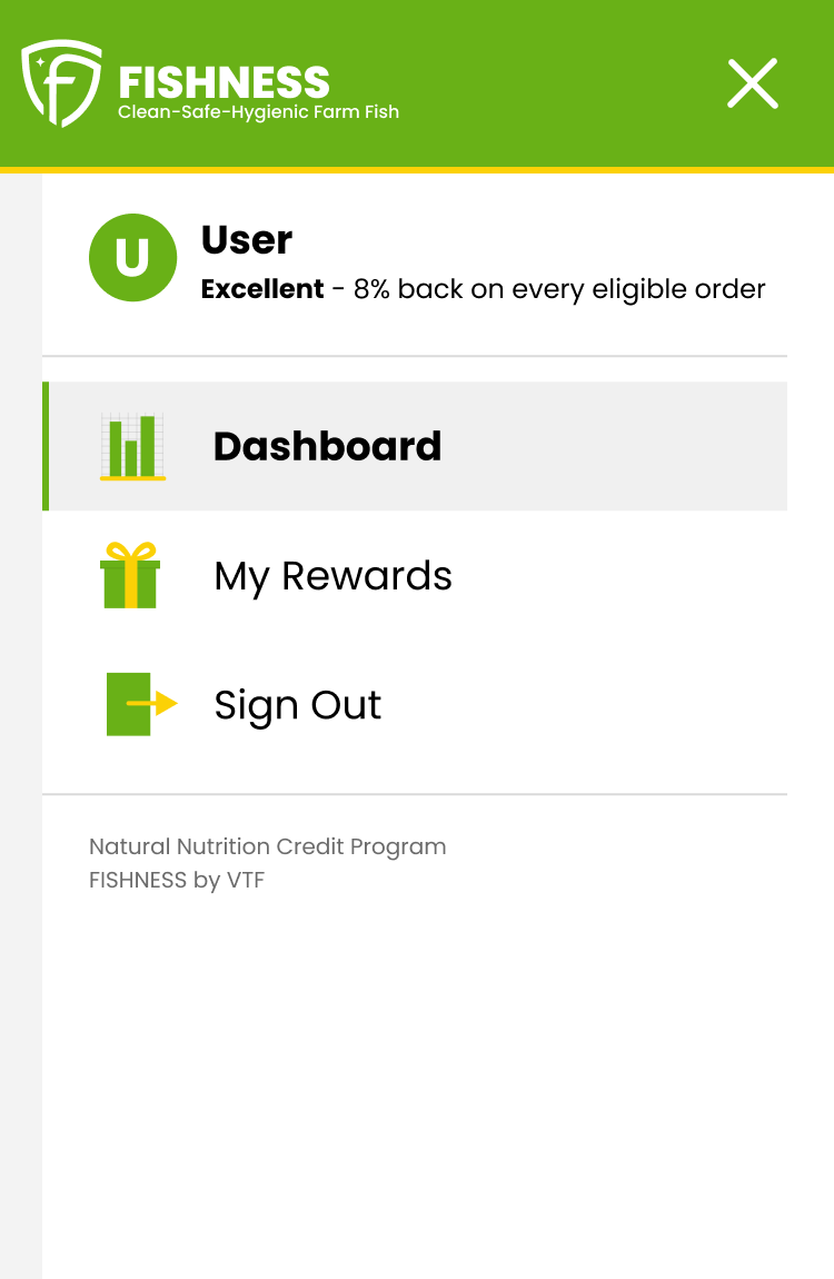
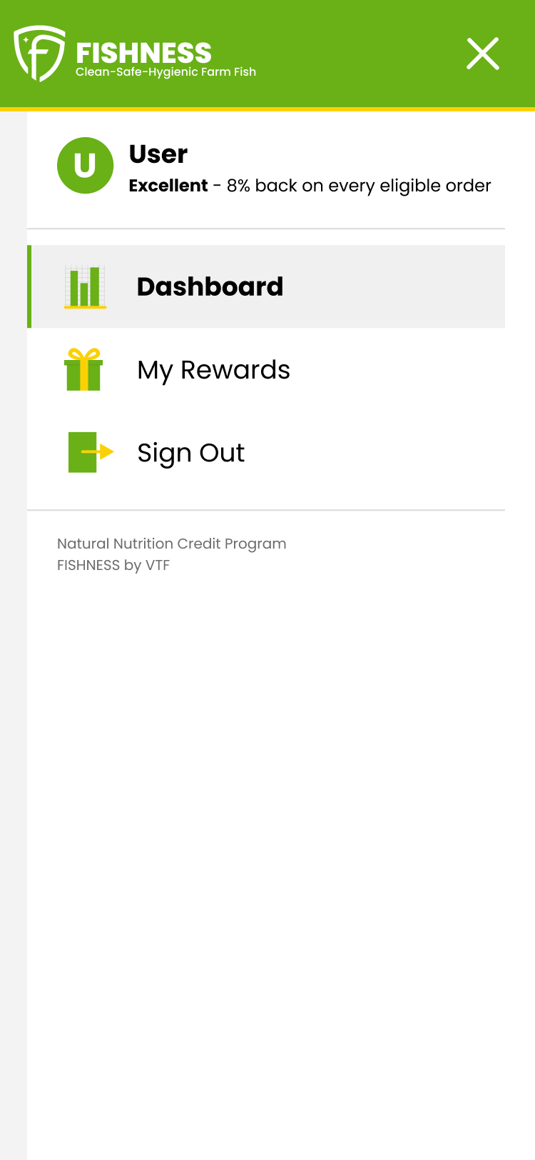
Emptying the drawer. The hamburger menu was carrying member details, benefits, and navigation all at once. Member data belongs on the page, not hidden behind a tap — so it moved out and the drawer kept only navigation. This is also what surfaced the live Sign Out bug: the drawer was so full that Sign Out had fallen below the fold on a phone.
Three states that didn’t exist
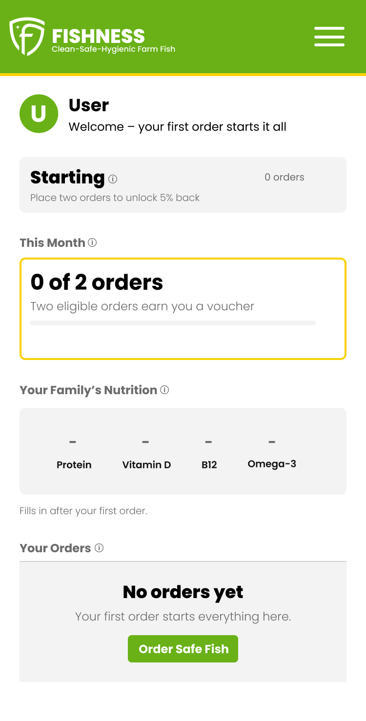
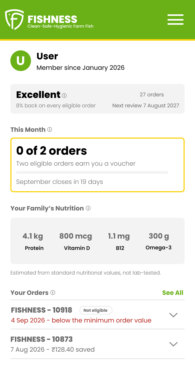
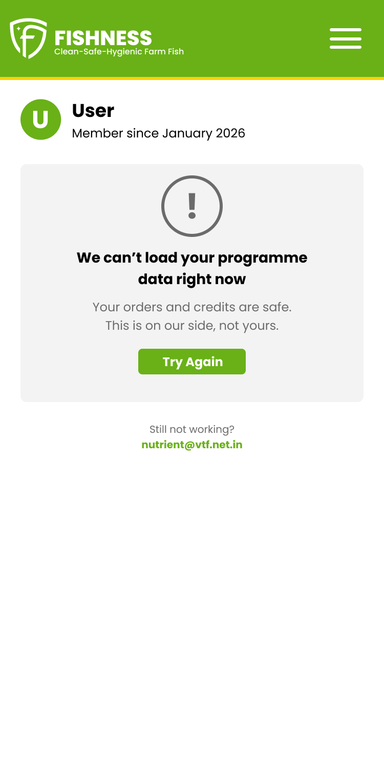
The founder described all three himself, in his own words, before I designed them: a page with no data loaded, no flow for orders that don’t qualify, and an error message still to be configured.
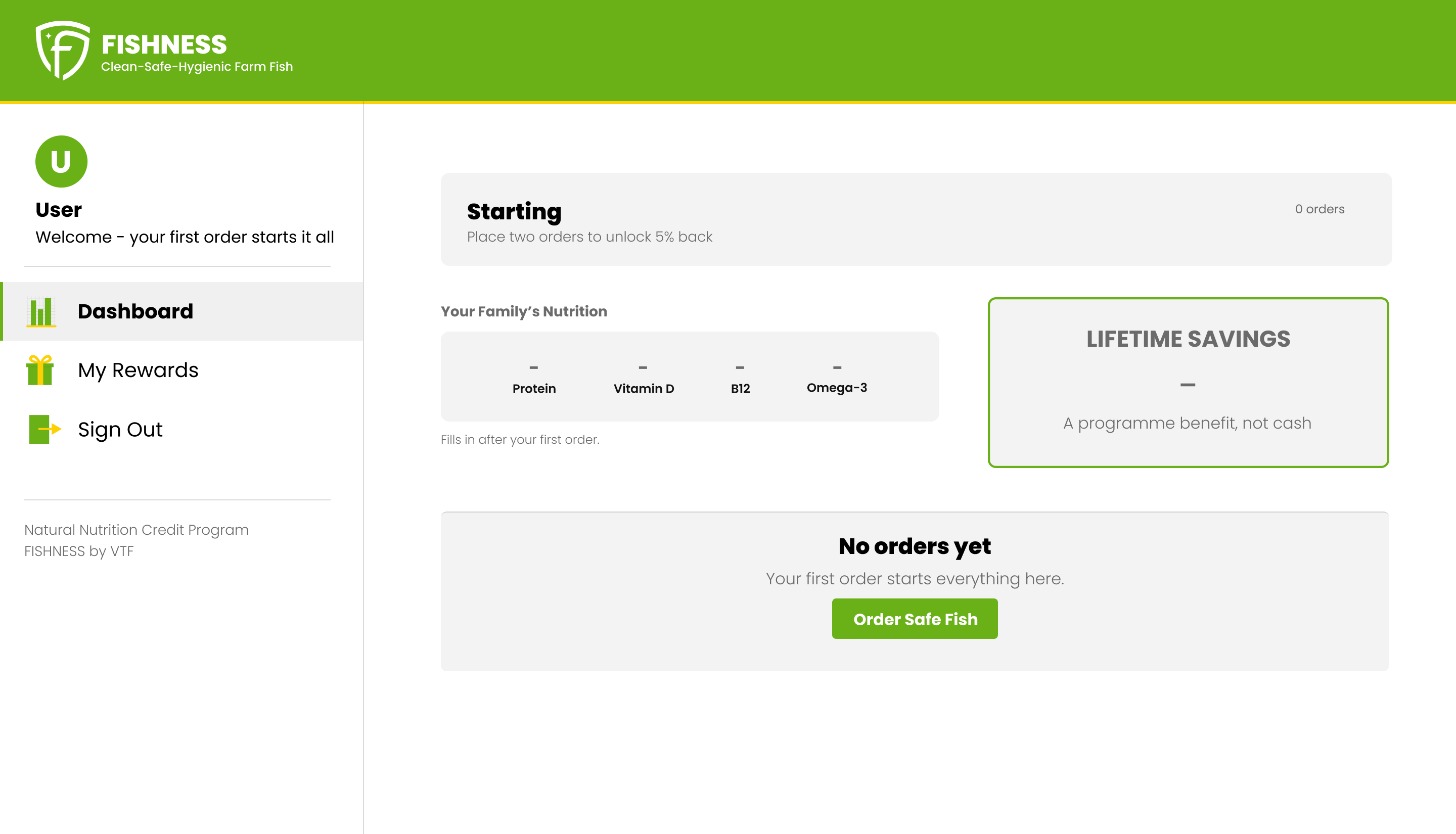
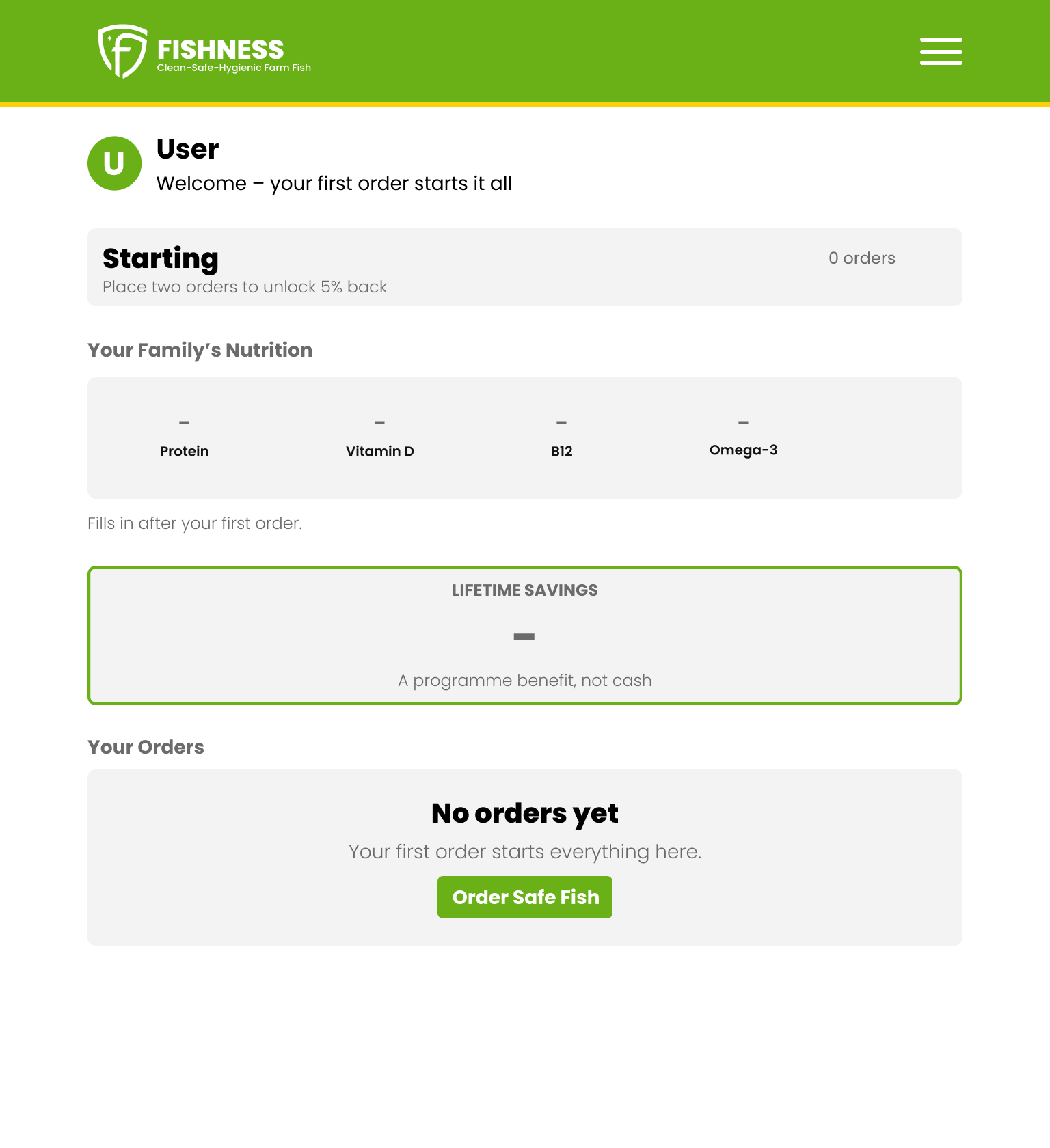
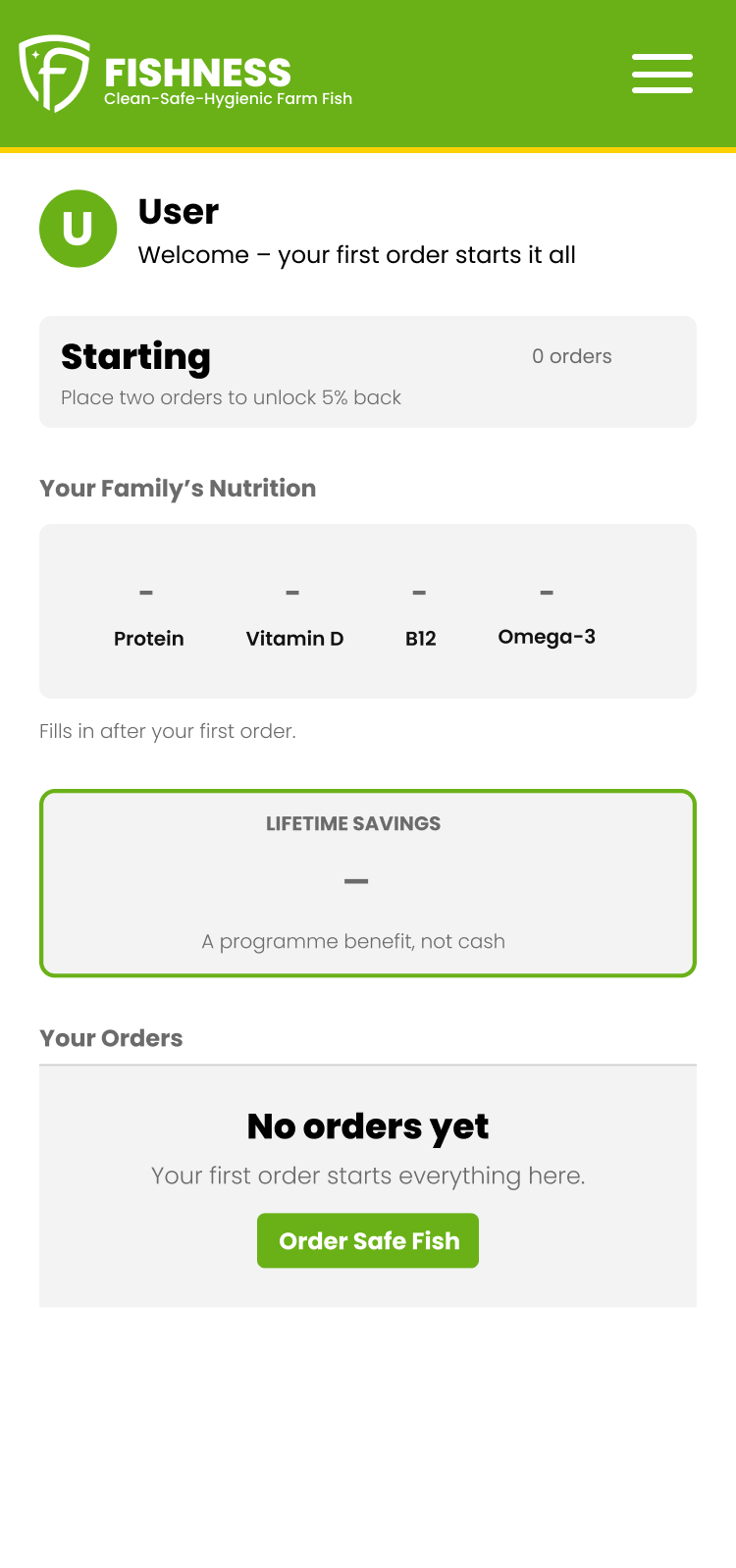
A new member. Someone who just joined sees the same five blocks, empty, waiting to fill. A blank page would tell them the program isn’t real yet. Instead the structure is visible from the first visit, and the empty orders block carries the one action that starts everything.
Nothing eligible this month. An order can fail the credit rules and still have fed a family, so this screen still shows its nutrition. Alongside it, the reason it failed — below the minimum order value, in plain words — so it can be avoided next time. Ineligible orders don’t reach the dashboard today, so this state waits on a change to what the storefront sends. It turned out to wait on more than that, and the state was cut — the new member and can’t-load screens both stayed.
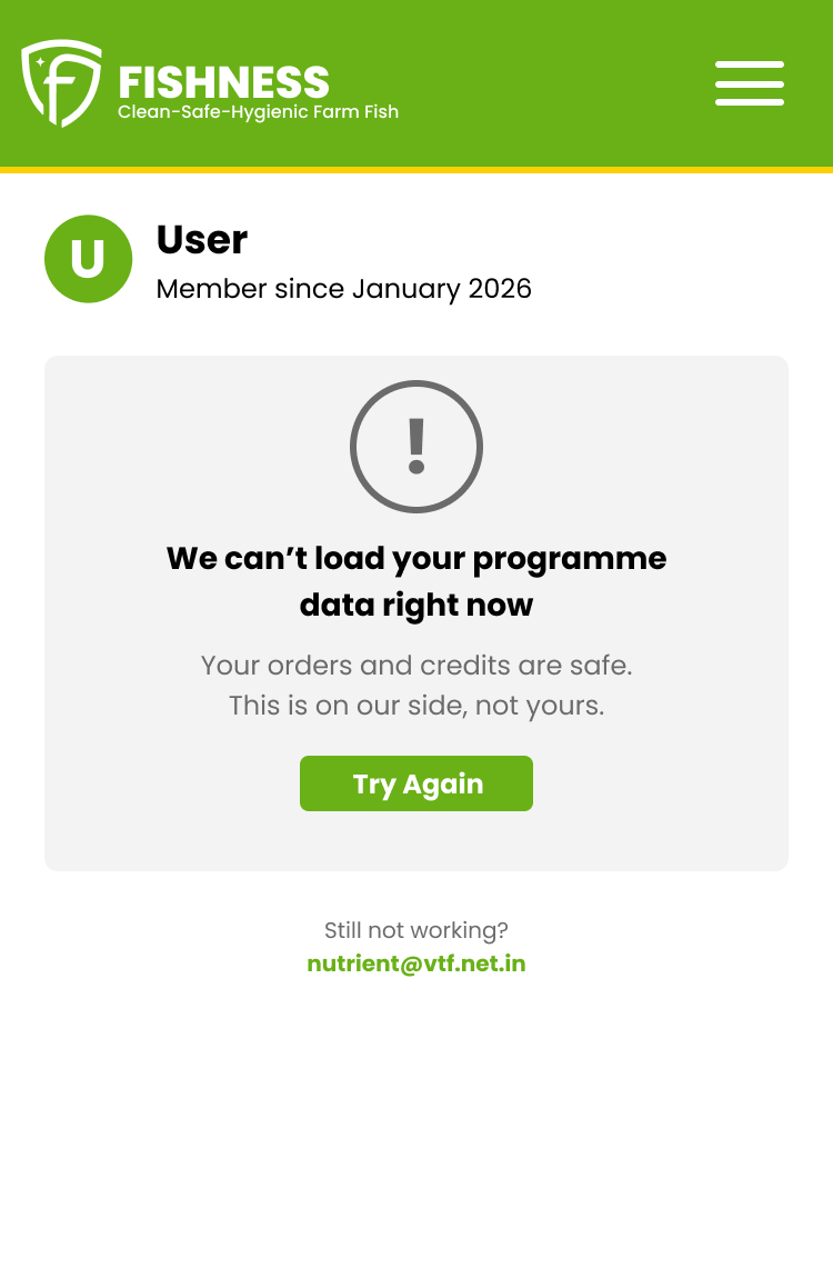
Can’t load. The member’s worry in that moment is whether their orders and credits are gone. The screen answers that first, says the fault is ours, and offers a retry and an email address.
One to fix now, eight to know about
None of these were asked for. They came out of using the product as a member.
On a phone, a member cannot log out. The menu carries so much content above the navigation that Sign Out falls below the fold. This is live, it’s small, and it doesn’t depend on anything else in the redesign.
The other eight are worth knowing whether or not the redesign proceeds.
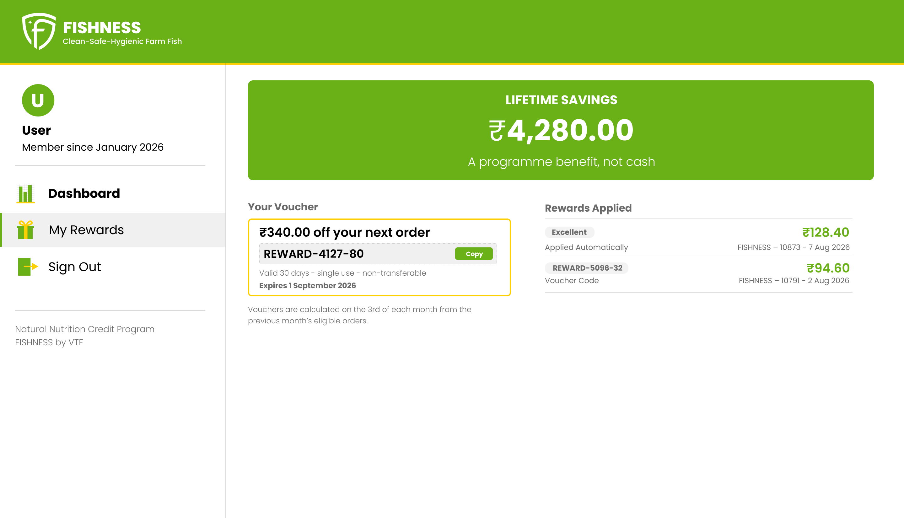
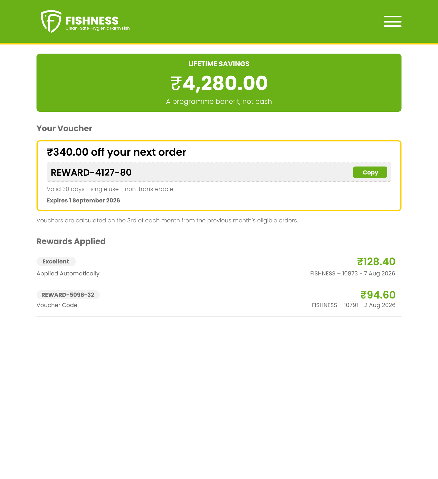
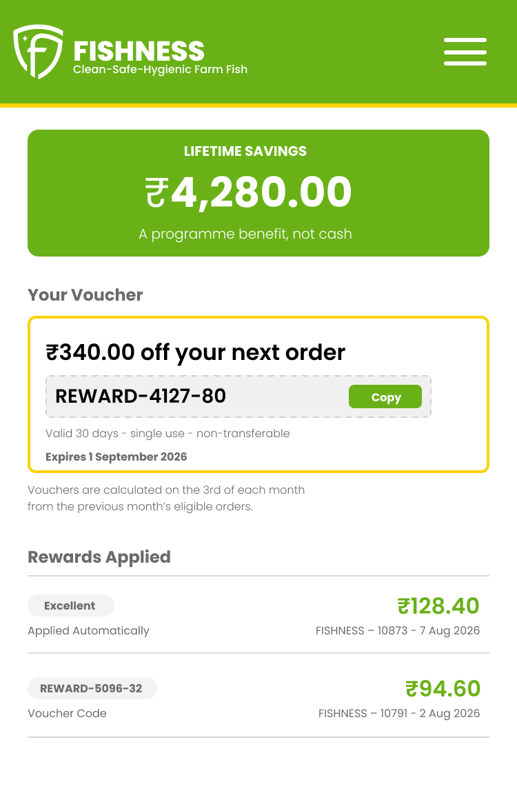
- The voucher card has no code on it. It tells members to copy a discount code, and there isn’t one there.
- Savings display as red negatives. Money saved reads as a charge.
- The program has three names. The navigation, the marketing page, and the dashboard each call it something different — across three names and two acronyms.
- The brand colors have drifted. The live site is running values slightly off the official pair, and nobody had noticed.
- Two more greens are in circulation that aren’t brand colors at all.
- White text fails contrast on both brand colors. Yellow at 1.5:1, green at 2.7:1, against a floor of 4.5:1.
- Order numbers carry two prefixes. The same list runs FISHNESS- and then switches to VTF-.
- There is no wordmark artwork. Only the shield is supplied.
Neither brand color carries white text
- Brand green #69B117 White text on it: 2.7 : 1
- Brand yellow #FBD106 White text on it: 1.5 : 1
Both below the 4.5 : 1 floor for normal text.
My own screen tells members they’re finished when they aren’t
The variable credit scales from 2% to 15% by monthly volume; the founder’s own example has six orders earning 6%. The block I designed shows 2 of 2 orders with a full progress bar.
Two orders is the minimum to qualify, not the target. A full bar at two says you’re done for the month, which is the opposite of what a volume-scaled credit is for. I built the thing the program needed — a view of the current month — and then drew it in a way that caps the behavior it exists to encourage.
I flagged it as a question for the founder rather than solving it myself, because how the count should move between 2% and 15% is his decision. His answer went further than the question: there is no count of qualifying orders anywhere in the system. The block was designed around a number that doesn’t exist.
The handoff: a brand reference, and a build staged so most of it ships without new data
Three things were delivered alongside the screens.
One name, settled. The program was running under three names and two acronyms across the navigation, the marketing page, and the dashboard. The brand reference opens by fixing the architecture: VTF is the company and belongs on invoices and compliance filings; FISHNESS is the consumer brand and leads everywhere a customer can see; NNCP is the program inside it. One page, and it exists to stop the drift rather than describe it.
A brand reference, nine pages, covering naming architecture, logo usage, color roles, a type scale across three breakpoints, spacing, components, and terminology. None of it was decided in the abstract. The type scale is the one the screens use; the components are the patterns the dashboard is built from; the terminology came from writing real labels. That’s why it’s short, and why every rule in it is already in use somewhere. It also names its own gaps — voice, photography, packaging, and logo construction are explicitly out of scope, because each needs work that hadn’t happened.
A build specification, ten pages, plus a pasteable CSS token file. Every block is marked as one of two things: a restyle of fields the program already sends, or something that needs data it doesn’t send yet. The conclusion is that most of the redesign is restyle, which means a good part of it can be built without touching the data layer at all. The Sign Out fix stands alone and could go first. The version that went to the development partner is nine pages and has no new-data column at all, for the reason the next section gives.
That staging wasn’t asked for. It exists because a redesign that arrives as one indivisible block is easy to postpone, and one that arrives in order of cost is easier to start.
What this doesn’t claim
The screens break a rule my own documents state. The findings page says white text fails contrast on both brand colors. The mockups then use white text on the brand green, in the header band, on every screen. That’s a real inconsistency and it’s mine. The screens use the official green because it’s the client’s color and changing it isn’t my call; the finding says a slightly darker green fixes it, and the token file ships that as a one-variable change. It’s a decision left open, and the honest version is saying so rather than defending it.
Poppins stands in for Garet. Garet is the production typeface and wasn’t available to me. Sizes transfer exactly; line-height may need adjusting when the real face goes in.
The spacing scale is a recommendation, not a description. The frames were spaced by eye. The scale in the documents is what the build should follow — the two do not match everywhere, and the documents say so.
The heading typeface on the live site is still unidentified. And the FISHNESS lettering in every screen is a stand-in, since no wordmark artwork exists.
Nothing has been built. No metrics, no adoption, no result.
The version that could actually be built
Every screen above this section shows the full design as approved. The version 1 screens at the end of this section are what went to the development partner.
On 17 September I walked the founder through the redesign on a call. He approved it and said it was better than what they have.
The next day, on WhatsApp, the scope changed — and it changed because every data assumption I had made was wrong.
I had designed This Month around a count of qualifying orders. There is no such count. In his words: “how many orders qualified, there is no such thing.”
I had designed a row treatment for an ineligible order — a pill and a red reason line so members would finally learn why something didn’t count. Ineligible orders never reach the dashboard at all. Shopify filters them upstream, so the screen I’d designed to explain a failure state is a screen for a state that doesn’t exist there.
I had listed aggregate nutrition totals as new data the development partner would have to build. They already exist. They’re just hidden.
And I had listed credit earned per order as missing too. It’s on the Rewards page, against every order, already.
Four assumptions, four wrong. Then his rule, which decided the rest:
“We don’t do any new thing first version, we go with what is there and next version we improve it.”
That rule cuts the block this entire redesign argues for. My thesis was that the dashboard records what happened while the program is about what happens next, and This Month was the thing that fixed it. It’s v2.
So V1 is everything buildable on data that already exists: the header, the menu and the Sign Out fix, the identity block, the category block, the order list restyle, the accordion nutrition, the totals unhidden, lifetime savings on the dashboard, Rewards showing savings in green instead of red negatives, and the missing voucher code.
Cut before export: the ineligible-order frame and the popover frame. The info icons went with them — I weighed keeping them, and they’re new jQuery work against a rule that says no new things.
The new member and error screens stayed. The founder had asked for both, and neither needs a single field the system doesn’t already have.
I sent the development partner V1 only. No mention of v2.
Two things I’d say about that, and they point opposite ways. The scope cut is correct: a version that ships beats a version that argues, and the fixes in V1 include the one that mattered most to a member — you can now log out on your phone. And the thesis took a real hit. The strongest idea in this project is sitting in a document nobody has committed to building.
The design is approved. V1 went to the development partner on 21 September, and the position in the section above this one still holds: nothing built, nothing measured. If I don’t hear back within a week, the agreement is that I go back to the founder.