EIKIRA
Agency to Software Parent — A Brand System Audited Against Itself
2026Introduction
Studio Eikira was a boutique brand and marketing agency with one name, one mark and a flat structure. Eikira is a software company that also does design — a parent with two arms, a product line, and a naming rule that puts the parent first. I ran the rebrand: architecture, marks, color, type, voice, values, the guidelines, and the site that replaced the old one.
The visual language survived almost entirely intact. The architecture around it changed completely. What follows is the before, the reasoning, and the after — with the live sites, not screenshots of them.
Before — Studio Eikira
The old site, running. It is not on the web any more — studioeikira.com now redirects to eikira.com — so this is a frozen snapshot of the last build before the rebrand, served from this repository and sealed in its own frame.
Version 1 · July 2026
The Agency System
One brand, one name, one mark. A cat seal carried across a gold-and-ink palette, with the wordmark set in Cinzel Decorative and the whole system pointed at a single audience: clients hiring a studio.
1 The mark

The cat seal — head, enso ring and Greek-key collar — used at every size and in every position. One mark did every job, which is exactly what a three-tier company cannot do.
2 Palette as it shipped
- Gold #D4AF37 Primary — the mark, accents
- Ink #14151A Primary — the base
- Ivory #EDE6D6 Secondary — ring, subtext
- Warm Paper #F4F0E8 Light section background
- Paper #FBF9F4 Light section background
Five colors. An earlier V1 draft carried two more — an oxblood and an emerald — which were cut once the build confirmed they were used nowhere except as pass and fail markers. They come back later in this story, demoted.
3 The lockup
STUDIO
EIKIRA
Small STUDIO over large EIKIRA, both gold, set in Cinzel Decorative. The size relationship between the two words was not drawn — it was the typeface doing it, which is the subject of the third thread below.
The method
One approach ran through the whole rebrand: write a rule, then audit it against itself, and fix it where it breaks on its own page. Most of what changed between V1 and V2 was not found by rereading the document. It was found by building something the document was supposed to describe, and watching the two disagree.
A guideline is a hypothesis until something is built against it. Three of those disagreements are worth showing, because in each one the thing that failed was not the design. Twice it was the measurement. Once it was a rule that was correct and still could not be used.
One — the metric lied
Choosing a mark for very small sizes needs a number, so I wrote one: the largest connected shape as a share of lit pixels at 16px. A low score means the mark has fragmented into specks. It ranked the candidates cleanly and retired the full seal from small sizes on the evidence.
Then it passed two things it should not have. The full-body cat scored 25% and was visually mush. The micro mark scored a perfect 100% — not because it was excellent, but because a solid silhouette is physically incapable of fragmenting. The first micro-mark draft also scored 100% and was a dark lump with two slits.
Fragmentation is one failure mode. Blobbing is the other, and the metric had nothing to say about it in either direction. The rule that went into the guidelines keeps the number and refuses to trust it alone.
Brand guidelines · §12, p16
What Survives at 16px
| Mark | At 16px | Outcome |
|---|---|---|
| Full seal — head + ring | 8.0% | Fails |
| SE monogram | 23.1% | Held — now retired |
| Head only | 32.1% | Best linework |
| Micro mark — silhouette | 100% | Holds — checked by eye |
The metric lies about solid shapes. The full-body cat scored 25% at 16px and was visually mush; the micro mark scores 100% because a silhouette cannot fragment. Fragmentation is one failure mode. Blobbing is the other, and no number detects it. Always check visually at true pixel size, in a real browser tab.
Two — a rule that was right and unusable
The casing rule told you which strings take caps and which take title case. Its scope note read: this governs type that is set. That sentence is accurate. It is also unusable, because it asks you to decide whether something is set type — a term of art — before you can apply the rule at all.
It broke on a real string. The PDF cover’s signature line sits in a display slot, is arguably set type, and is unmistakably a sentence — and by the time anyone looked, the product’s own name was being set three different ways across four places in the repo, each one defensible from the rule as written. The replacement asks something anyone can settle without the vocabulary: is this a sentence, or is it a label?
A second audit, after the rule was rewritten, turned up the opposite failure. METIS, set in caps across four files — including the site title, which is the browser tab on every page and the name on every shared link. Metis is a product, and products are title case everywhere — in sentences and as labels alike — because case is the tier signal: a product set in caps would read as an arm. Nothing here was ambiguous. This was one error copied four times, rather than four readings of a hard rule.
Both belong to the same rule, in opposite directions. Where it left room, it produced a spread and every answer looked careful. Where it left none, nobody had read it.
Brand evolution doc · amendment 10
One Product, Three Names
1 The same name, four places
Metis by Eikira
browser tabEikira Metis
site name in link previewsEikira Metis
link preview imagePREPARED BY EIKIRA METIS
PDF coverOne product, one rule, four places, three names — and nothing in the rule could settle which was right. Metis by Eikira was arguably already correct, and that is the problem rather than the exception: a rule that cannot decide its own hard case does not produce one error to find, it produces a spread in which every answer looks careful. These were corrected piecemeal on 28 August, 31 August and 2 September, in separate commits for separate reasons — each file settled alone, by whoever happened to be in it.
One file disagreed with itself. One line set the browser tab to Metis by Eikira; another, fifteen lines down, set the site name in link previews to Eikira Metis — two answers, from one rule and one person.
The preview image belongs on this list because its name was set as type then — two spans, not a drawing. It became artwork only when the fix replaced it with the lockup file, and the rule has never reached artwork: a wordmark is drawn, so a casing rule about typesetting has nothing to say about it.
2 Scope, and what it leaves out
V1 · scope, no complement
This governs type that is set.
Nothing says what it excludes, so “set type” has to be settled before the rule can be used at all.
V2 · scope, completed
… and it does not govern logotype artwork.
A wordmark is a drawing, not typeset text. One added clause, and you can see which you have.
The attribution line is named in the rule, not left to the test. by EIKIRA looks like an exception — it is short, and it reads like a fragment of a sentence — and is not one: standing on its own in a product lockup it is a label, so it takes caps. Written into a sentence it follows the sentence, and becomes Metis, by Eikira. A rule that leaves its own hard case unnamed hands it back to whoever is typing.
A rule that requires you to classify before you can apply it will be applied inconsistently, and the inconsistency will look like carelessness rather than like an unusable rule. That is what makes this failure harder to catch than a wrong number. Nobody was wrong. The rule was right, and it could not be used.
Three — a quirk, not a choice
V1's wordmark set STUDIO in caps over Eikira in title case. The casing was a decision — caps on the brand name so it read as the primary word, and because it simply looked better that way. What was not a decision was the size gap the casing produced. Nobody specified one; Cinzel Decorative renders uppercase noticeably larger than title case, and the lockup ended up accommodating that.
Both strings below are set at the same font size. The gap between them is the typeface's, not the designer's — so the most conspicuous feature of the wordmark was discovered rather than drawn, and could only be worked around. V2 keeps the intent and drops the mechanism: plain Cinzel, with that contrast rebuilt as scale someone actually sets.
Brand guidelines · §16, p20
Cinzel Decorative Is Retired
EIKIRA
typed EIKIRA · 78px renderedEikira
typed Eikira · 58px renderedCinzel Decorative, both lines at one font size, differing only in how they were typed. The face has no true lowercase — it draws minuscules as small capitals — so title case comes out as caps at a smaller size: EIKIRA at 78px against Eikira at 58px, a gap of 1.35× that nobody specified. That is what produced V1's size contrast. The casing was chosen; the size was inherited. V2 sets it instead, in plain Cinzel.
The architecture
Underneath the three threads, the structural change: a flat brand became a three-tier family. EIKIRA is the parent. EIKIRA STUDIO and EIKIRA TOOLS are sibling arms. Metis is the first product, with an AI persona inside it. The parent name always comes first, which is why “Studio Eikira” was retired as a written name in favor of “Eikira Studio” — both arms then share one pattern.
That produced the mark rule that replaced one mark doing every job: one mark type per tier. Parent takes the full-body cat. Arms take the head only. Products take the enso ring with a geometric object inside it. No overlap, so the mark alone tells you what level of the business you are looking at.
Casing carries the tier too — parent and arms in caps, products in title case — so every future product inherits the rule without a new decision being made.
After — Eikira
The live site, embedded the same way. It is the real eikira.com, running now, in a sealed frame at both a desktop and a mobile viewport.
Version 2 · August 2026
The Parent System
The same cat, the same gold, the same pattern — rearranged around a parent and its arms. What changed is what each element is for, and one color was promoted from an undocumented working value to a named entry with a stated restriction.
1 The colorway reversal
Earlier V2 spec
EIKIRA
STUDIO
Shipped
EIKIRA
STUDIO
The constant stays quiet; the variable carries the accent. An earlier spec stacked gold on gold on gold — cat, EIKIRA, and descriptor all gold — and the accent stopped working. EIKIRA is the same in every lockup, so it doesn’t need emphasis; the descriptor changes, so it takes the gold.
2 Palette, V2
- Gold #D4AF37 Primary — accents, descriptors, graphic use
- Ink #14151A Primary — the base, and body text on light grounds
- Ivory #EDE6D6 Secondary — wordmark, subtext on dark
- Warm Paper #F4F0E8 Light section background
- Paper #FBF9F4 Light section background
- Muted Ink #6E695F Secondary text on light grounds — body size is fine
Muted Ink is the addition, and it was already in use as an undocumented working value before it was named. The restriction it carried — captions only, larger sizes only — came from the wrong row in the second thread above, and went away when the row was recomputed.
3 Type, V1 to V2
V1 — Cinzel Decorative
Studio EIKIRA
The wordmark and every header. Its caps/title-case size difference was doing the design work.
V2 — plain Cinzel
EIKIRA
set, not inheritedOne fewer typeface. Hierarchy by size, never by weight, and headers kept under five words — a length rule rather than a second typeface rule.
Plain Cinzel is shown in a near-match fallback — only the display face is loaded on this page.
Built against the system
The V2 guidelines didn’t stop at a PDF. The brand has to hold when the person making the slides has never met me, so I built the guidelines into templates. A few rules are enforced by the layout itself: a fixed title box clips a long title, and a twelve-column grid has no room for a fourth column. Most are notes written into the placeholder copy, read at the moment they apply. Then I tested it by feeding it things the rules forbid.
Not every rule can be enforced by a layout. The demo shows the ones the template refuses and the one it can’t.
Built from the V2 guidelines
One System, Put to Work
The same system on other surfaces
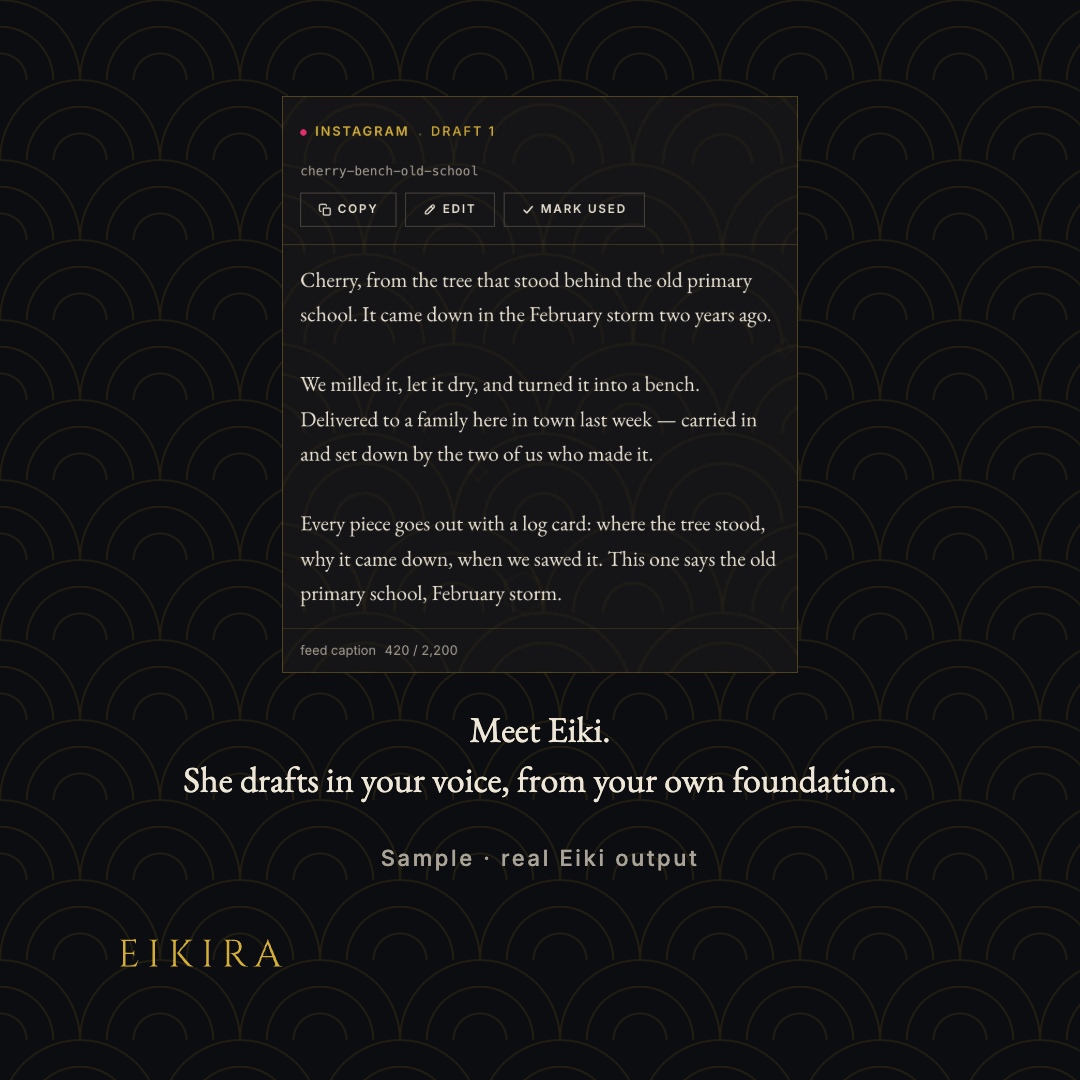
The same system produced a sales one-pager and an 11-post launch campaign. Where the campaign needed something the guidelines didn’t cover, like a blur-to-clear sequence or a product screenshot, the answer became a template and a recorded rule, not a one-off card.
What survived
A repositioning this size did not require starting over. The cat, the seigaiha pattern and its overlay rule, EB Garamond and Inter in their existing roles, the origin story, and one voice principle carried over verbatim. The palette lost two colors mid-V1 and gained one promoted from working use.
What changed was the architecture around all of it — and the discovery, three times over, that the thing most likely to be wrong in a brand system is not the design but the number someone wrote down to justify it.
The guidelines are 26 pages, the site is live, and studioeikira.com redirects to it. Every rule in the document has an artifact behind it now — which is the only test that ever found anything.