Spotify Concept
From Corporate Utility to Cultural Destination
2026Speculative concept
An unsolicited rebrand concept. Not client work, and not affiliated with or endorsed by Spotify. All Spotify marks belong to their owner.
Problem statement
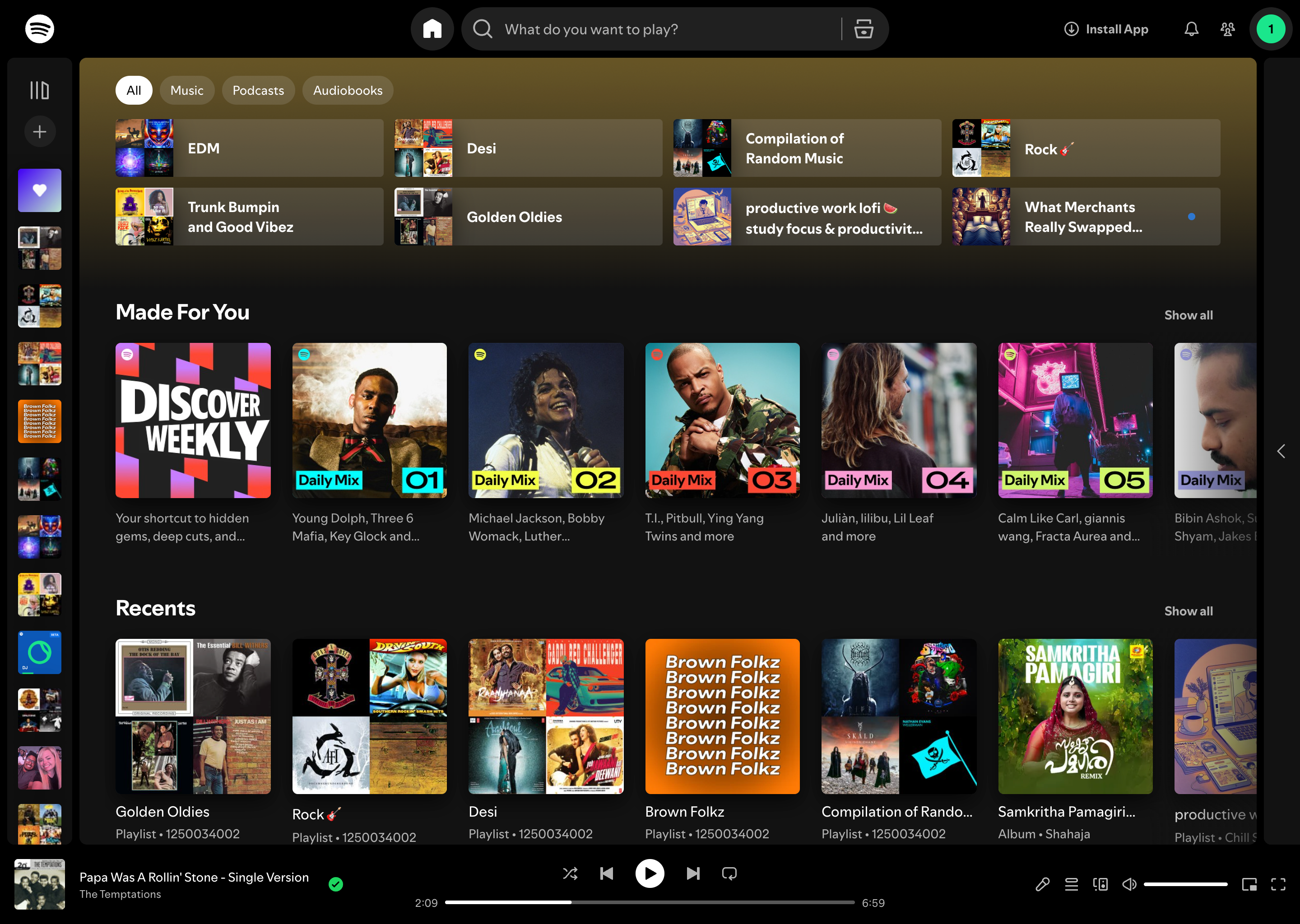
Spotify doesn’t look like a place where human creativity lives. It looks like a database where it’s stored.
Spotify’s visual identity and interface architecture fail to express the brand’s own mission of unlocking human creativity. Despite being one of the world’s leading music platforms, the experience reads as corporate utility rather than cultural destination — a black void of undifferentiated content competing for attention without emotional guidance.
The result is a platform that has outgrown its visual language.
The work
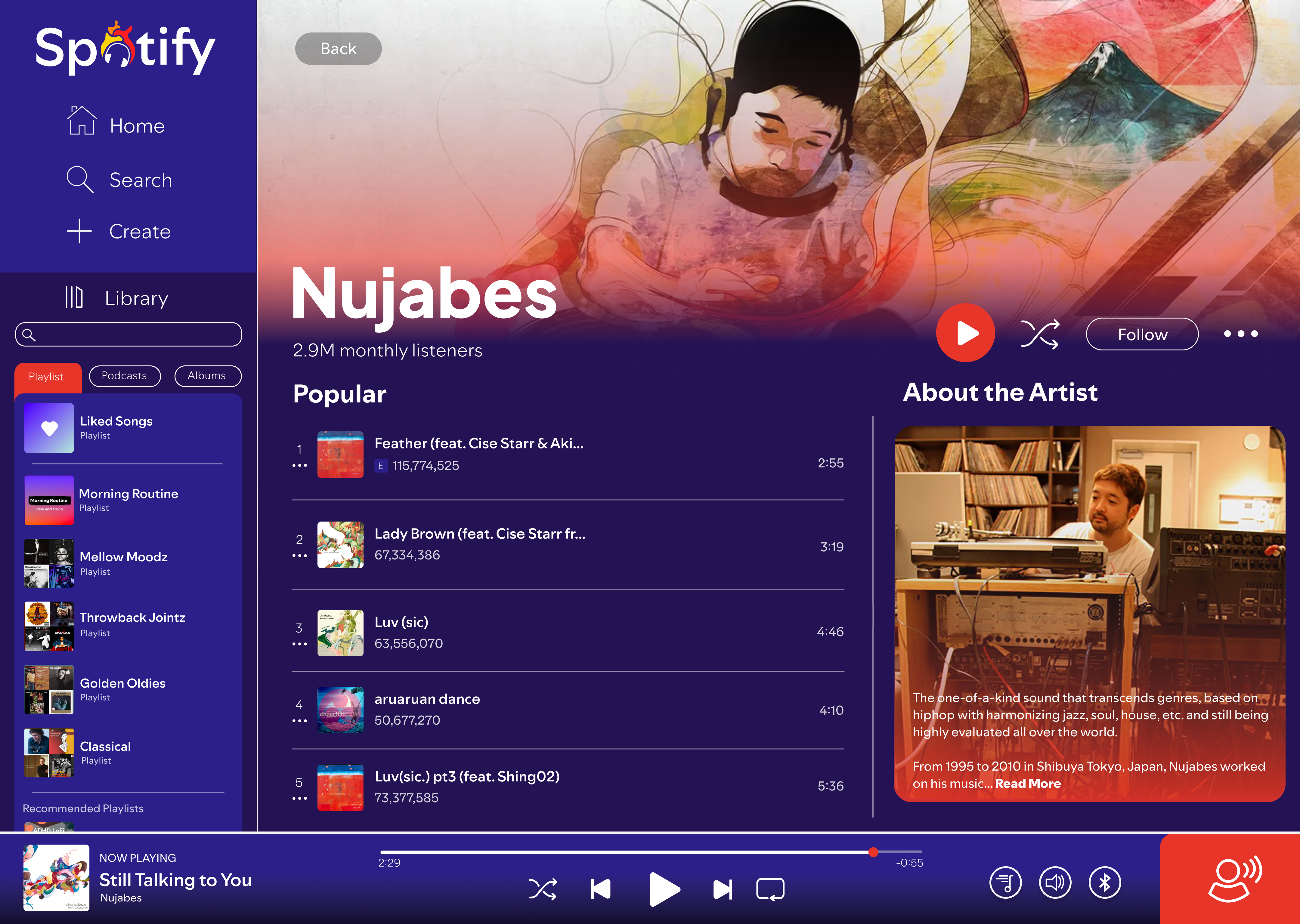
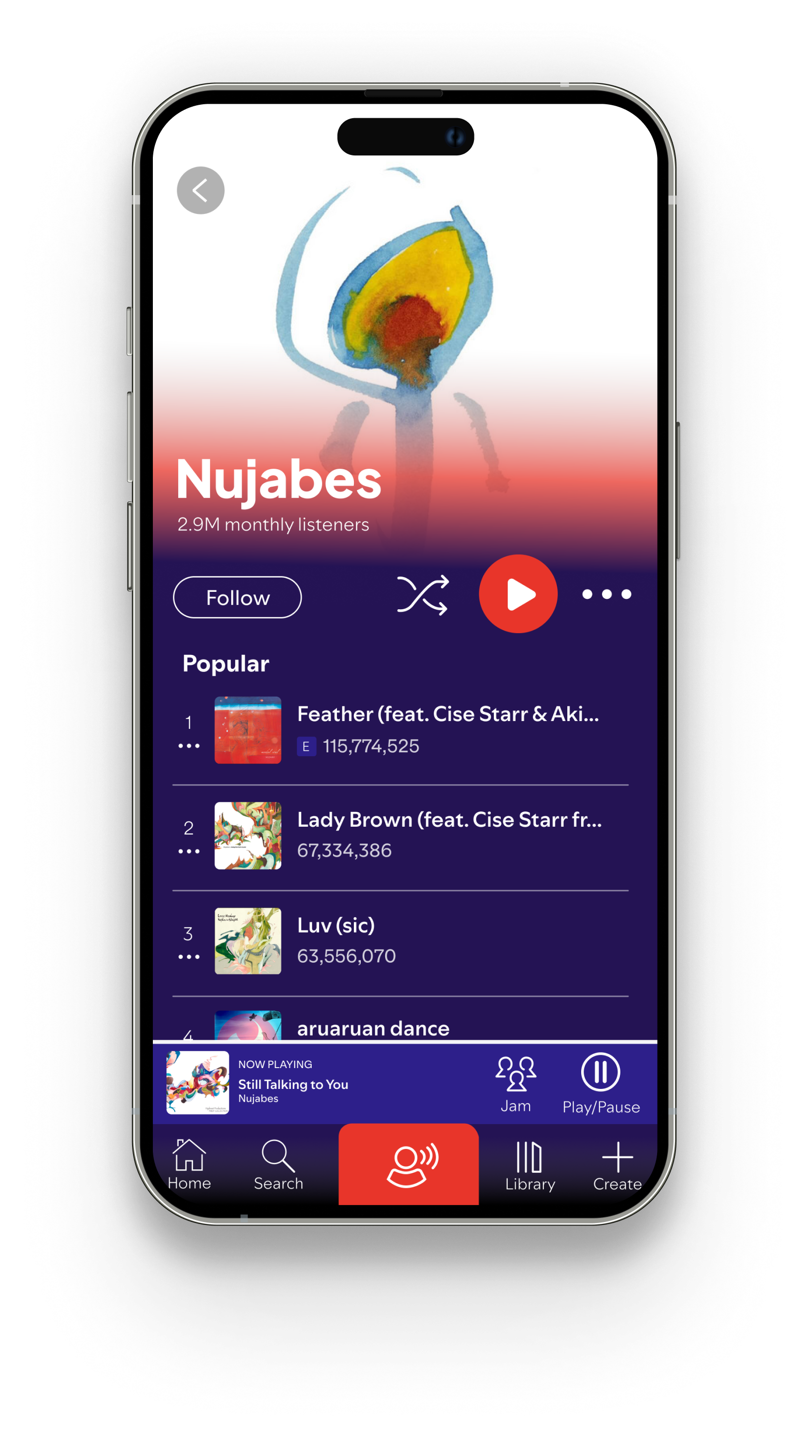
Spotify is where an enormous amount of the world’s music actually lives — but you wouldn’t know it from the interface. The product treats a Nujabes record and a utility bill with the same visual weight: rows, thumbnails, a play button. All the cultural gravity is in the catalog and none of it is on the screen.
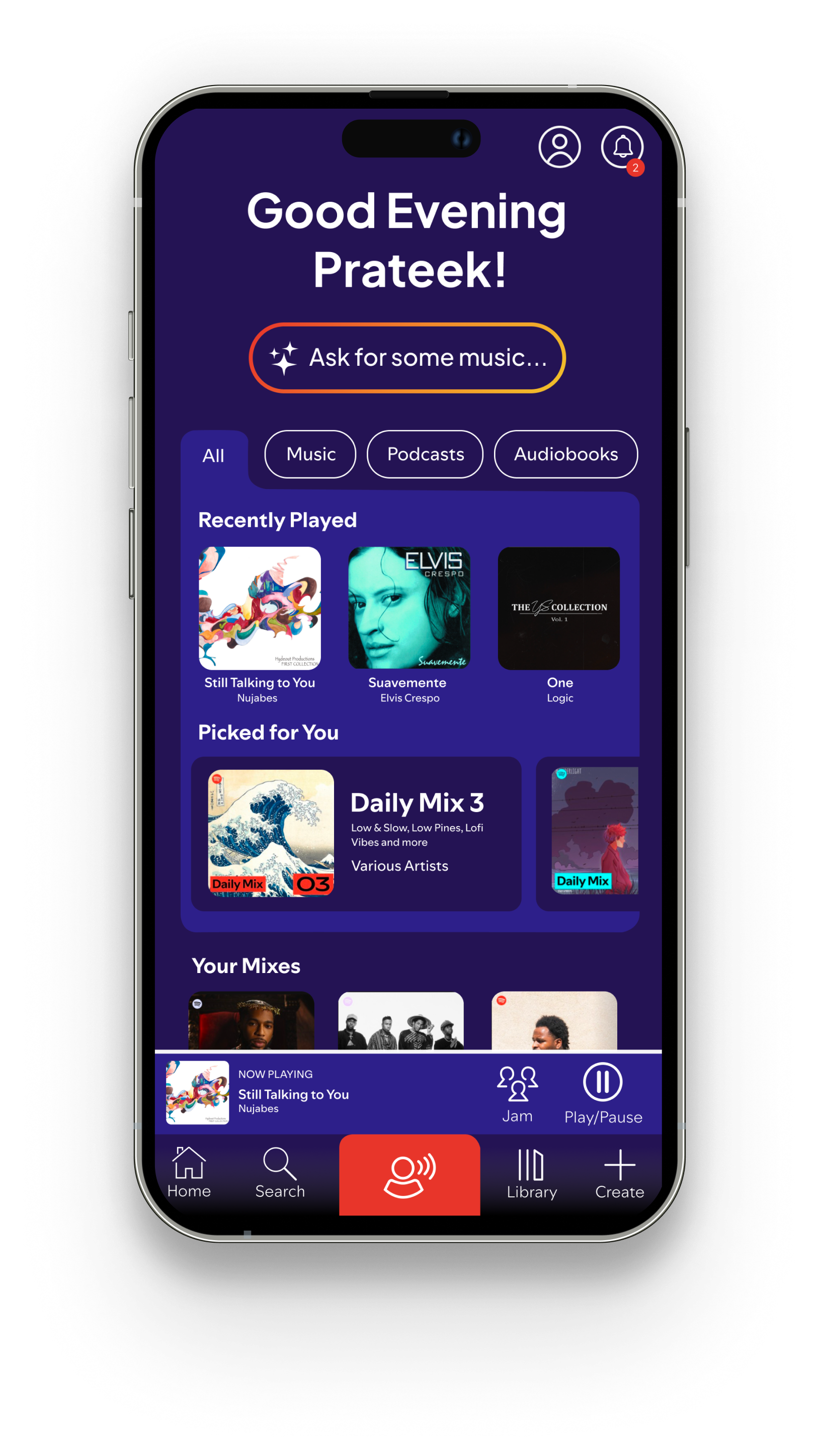
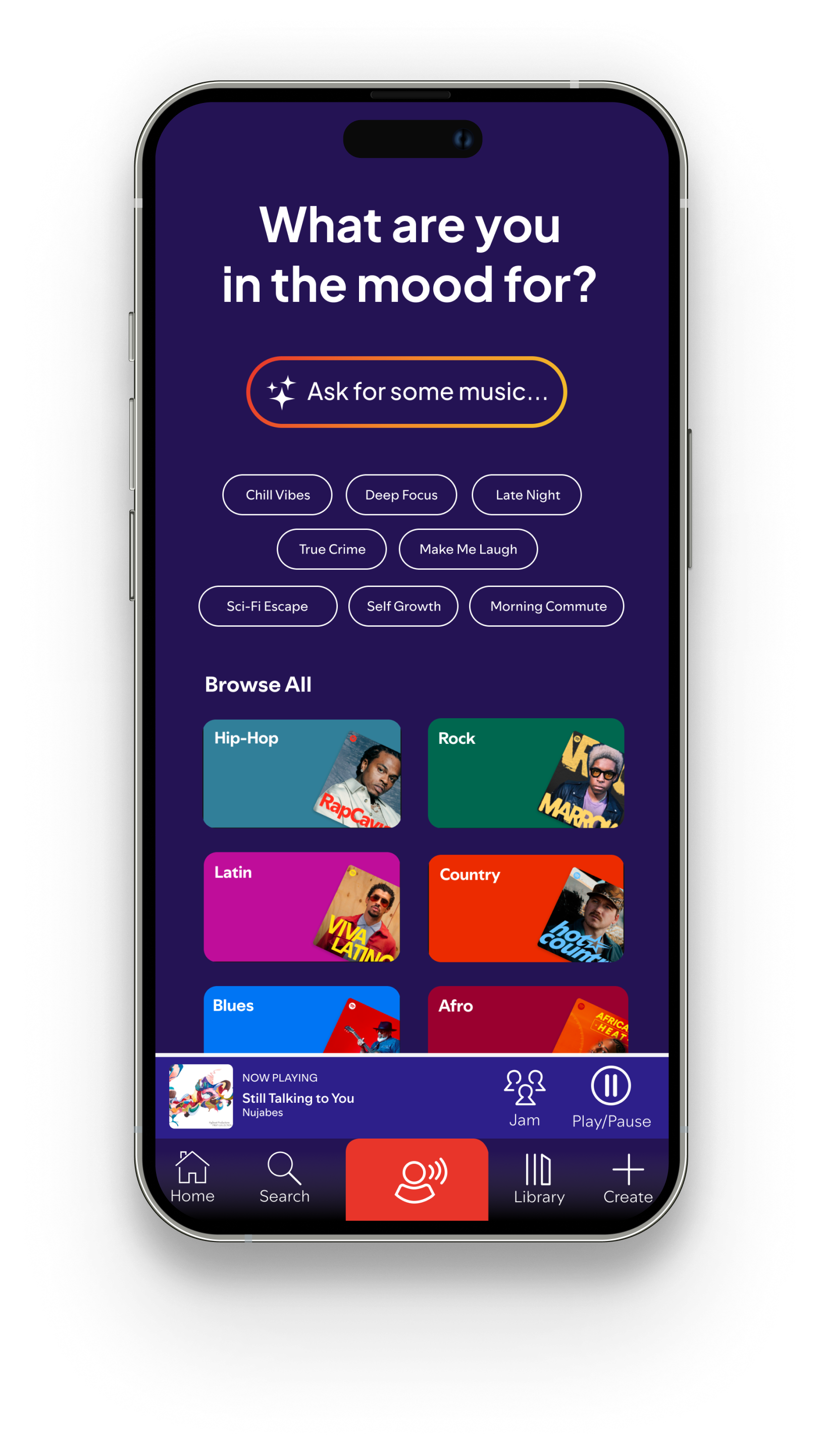
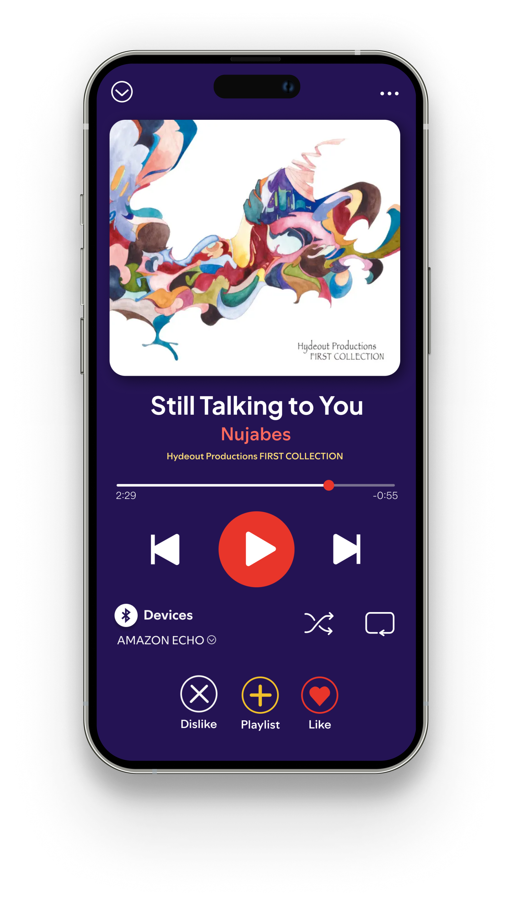
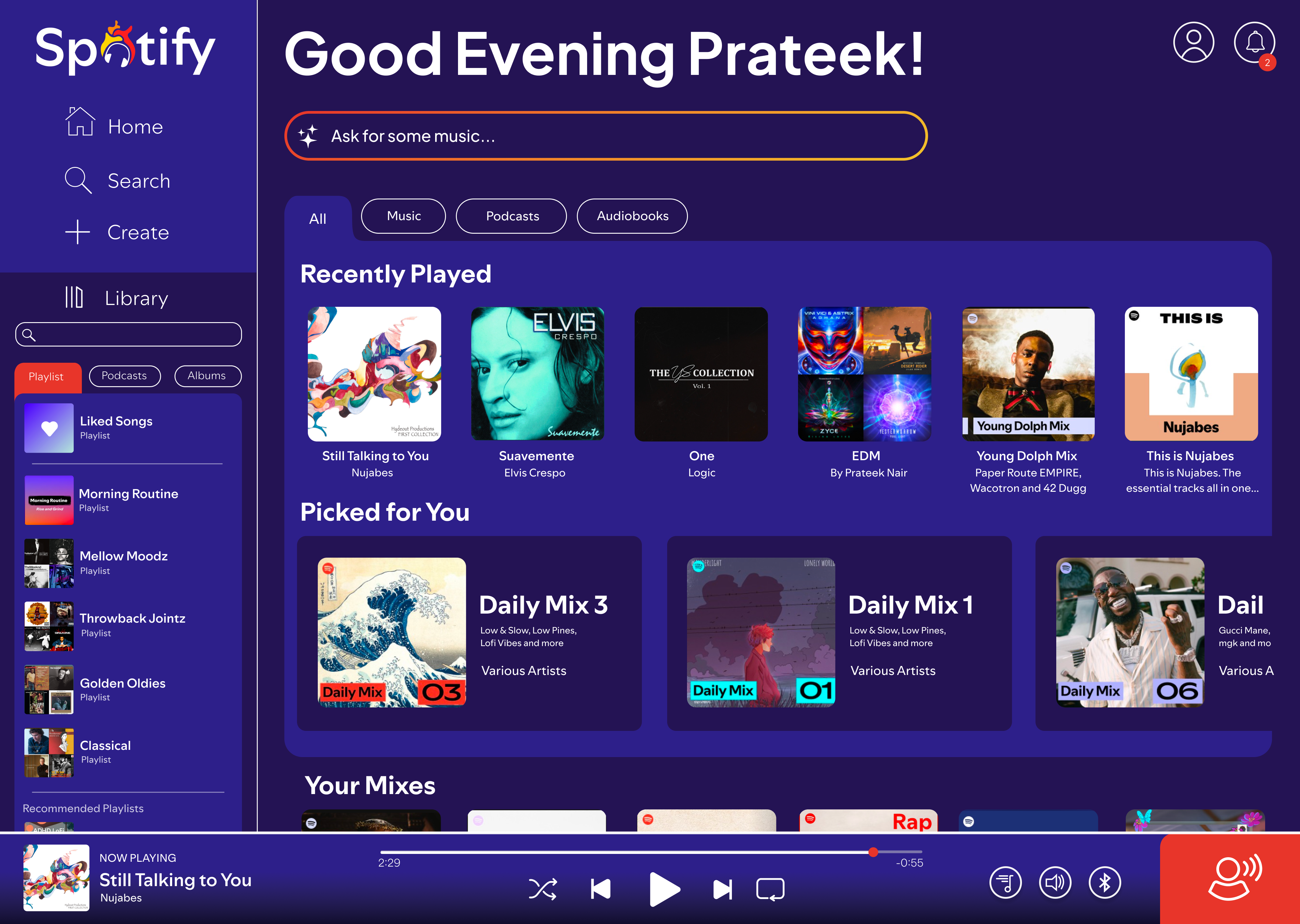
This rebrand asks what Spotify would look like if the interface believed in the music as much as the marketing does. Color stops being decoration and starts carrying meaning — orange for the platform, red for artists, yellow for listeners — so the app signals what kind of thing you’re looking at before you read a word. The identity leans into heat and vitality rather than the flat green-on-black that reads as infrastructure.
Spotify: speculative rebrand
Brand Identity
Color carries meaning rather than decoration. Each family is tied to a role — artists, platform, listeners — and the foundation purples hold the creative space they all sit in.
1 Logo

Wordmark shown in a near-match face — Spotify Mix is proprietary and not licensable.
Long form
Primary use — headers, marketing, full brand presence.
Short form
Standalone use — app icon, favicon, small applications. Direction 2, Revolution: the chosen direction.
2 Color system
- Deep Purple #241354 Foundation / creative space
- Passion Red #E8352A Artists / primary actions
- Vitality Orange #F2882A Platform / podcasts
- Joy Yellow #F2C12A Listeners / discovery
3 Pill states
4 Typography
Display / headlines
Discover
Plus Jakarta Sans
Screen titles, artist names, section headers. Bold and tightly tracked, so a headline reads as a statement rather than as a label.
UI / body / labels
Navigation, metadata, body copy, timestamps.
Spotify Mix
Shown in a near-match fallback — Spotify Mix is proprietary and not licensable.
The intended UI face. It carries everything the display face does not, and never competes with it.